MyMuse Packaging Design
MyMuse is a brand for people who love to love. As India’s first bedroom essentials brand — MyMuse is on a mission to make intimacy easy, approachable and fun for Indians everywhere.
As a brand that is always inclusive of diversity in gender, sexuality and sexual expression, MyMuse creates high-quality, well-designed products for your intimate spaces, and content that’s informative and real. A brand designed with Big Instagram Energy, MyMuse is all about elevating the bedroom experience, with beautifully designed products that are discreet, body-safe, and oh-so-pleasurable.
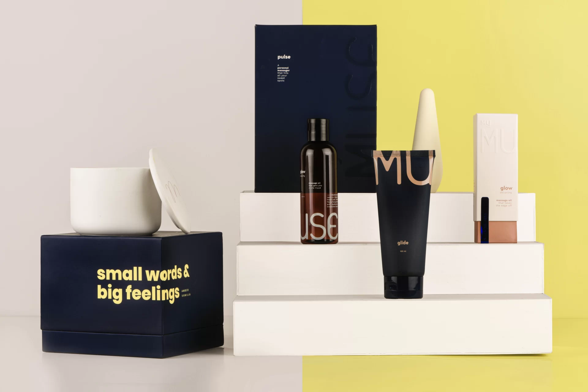
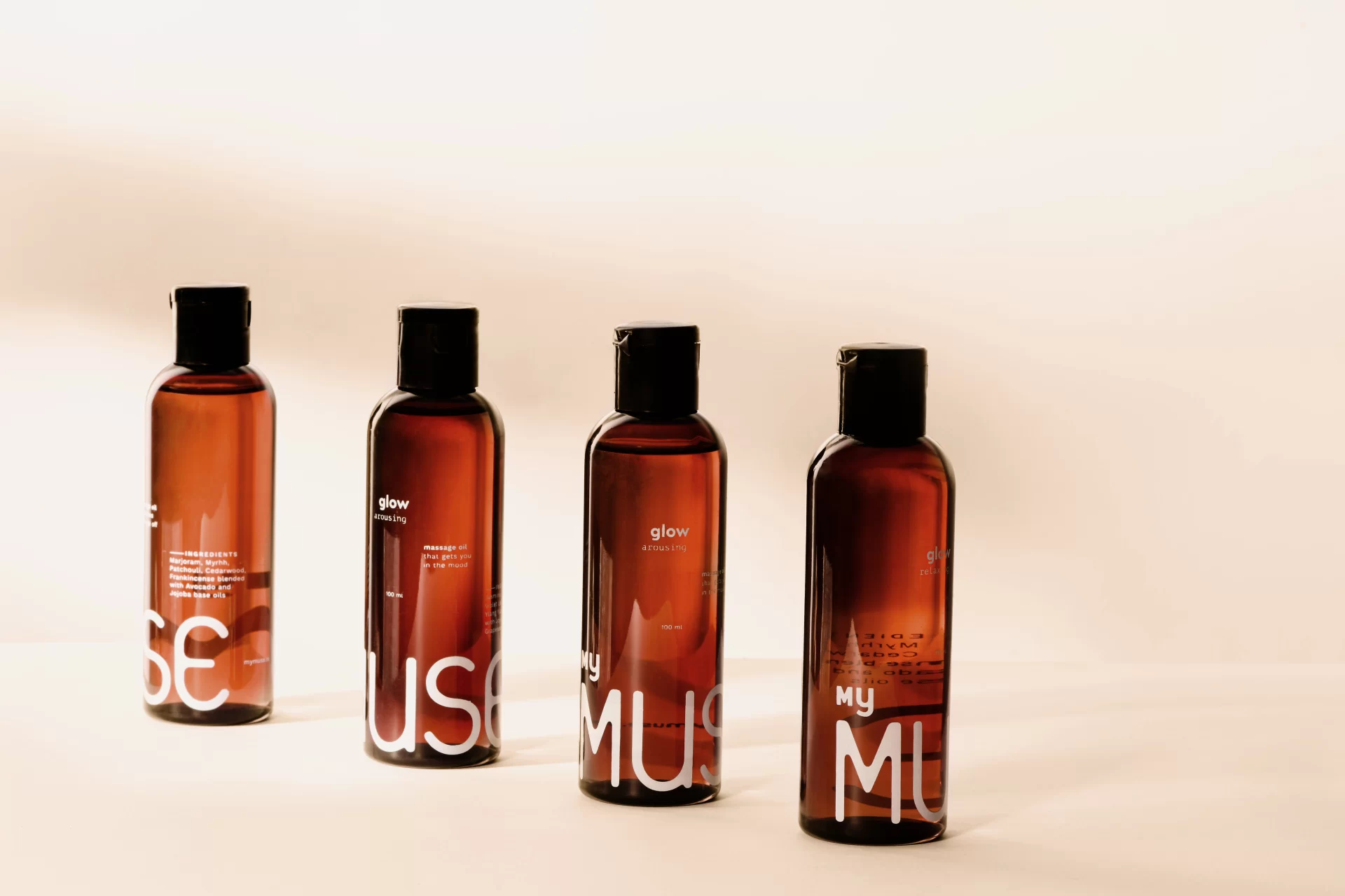
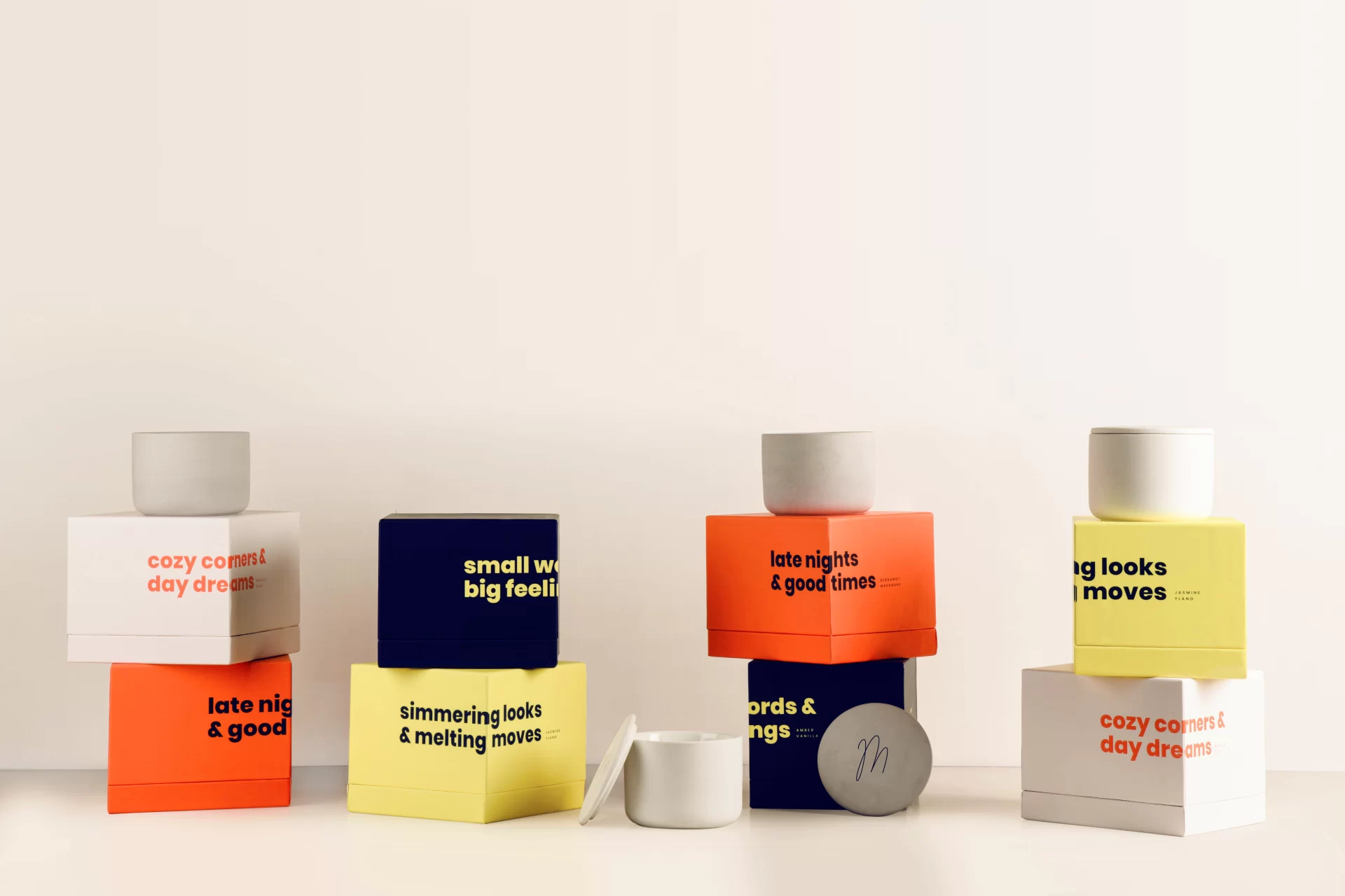
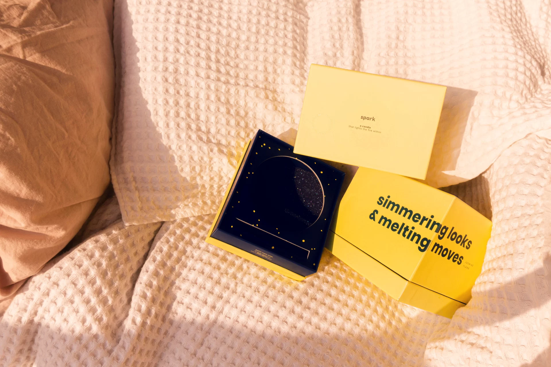
MyMuse products are designed to be a part of someone’s most intimate spaces. The kind of spaces where they find themselves shedding way more than inhibitions. This is where one feels at home, at ease and truly unconfined. These products are tools for comforting, calming, cleansing or arousing in that space. Luxurious to touch and inviting for the eyes, MyMuse packaging should at times draw them to use it but at the same time become invisible as a part of their everyday life.
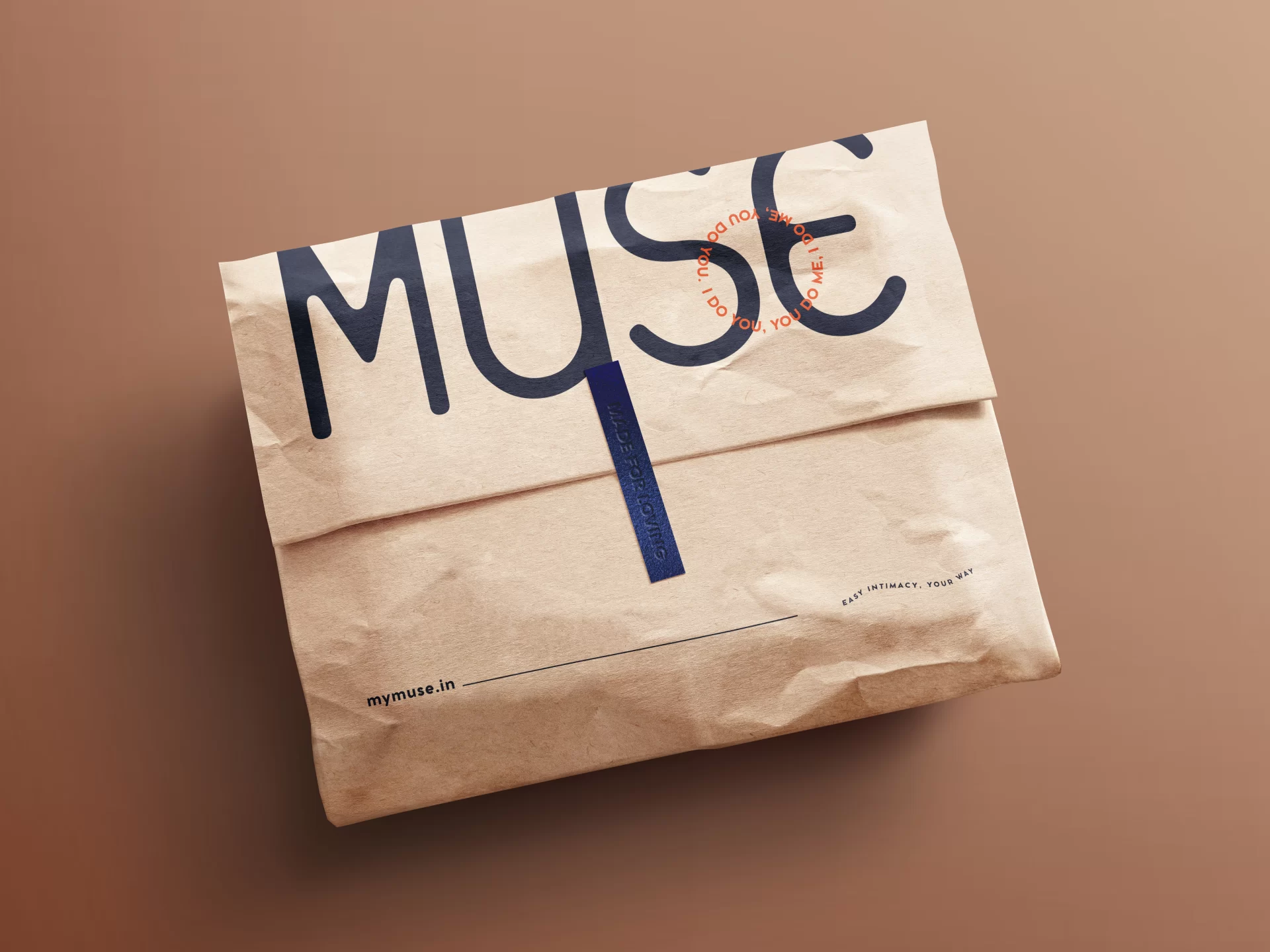
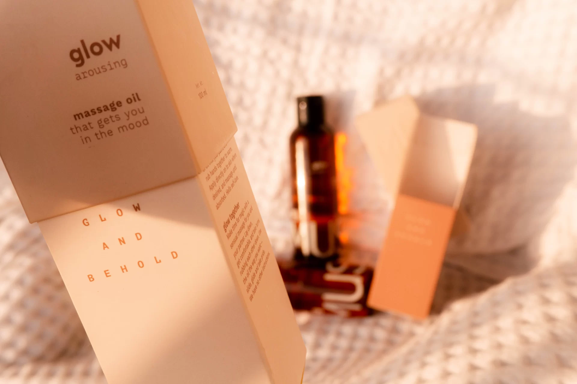
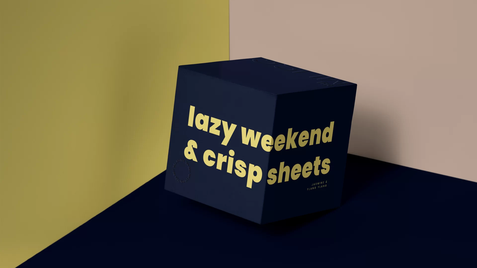
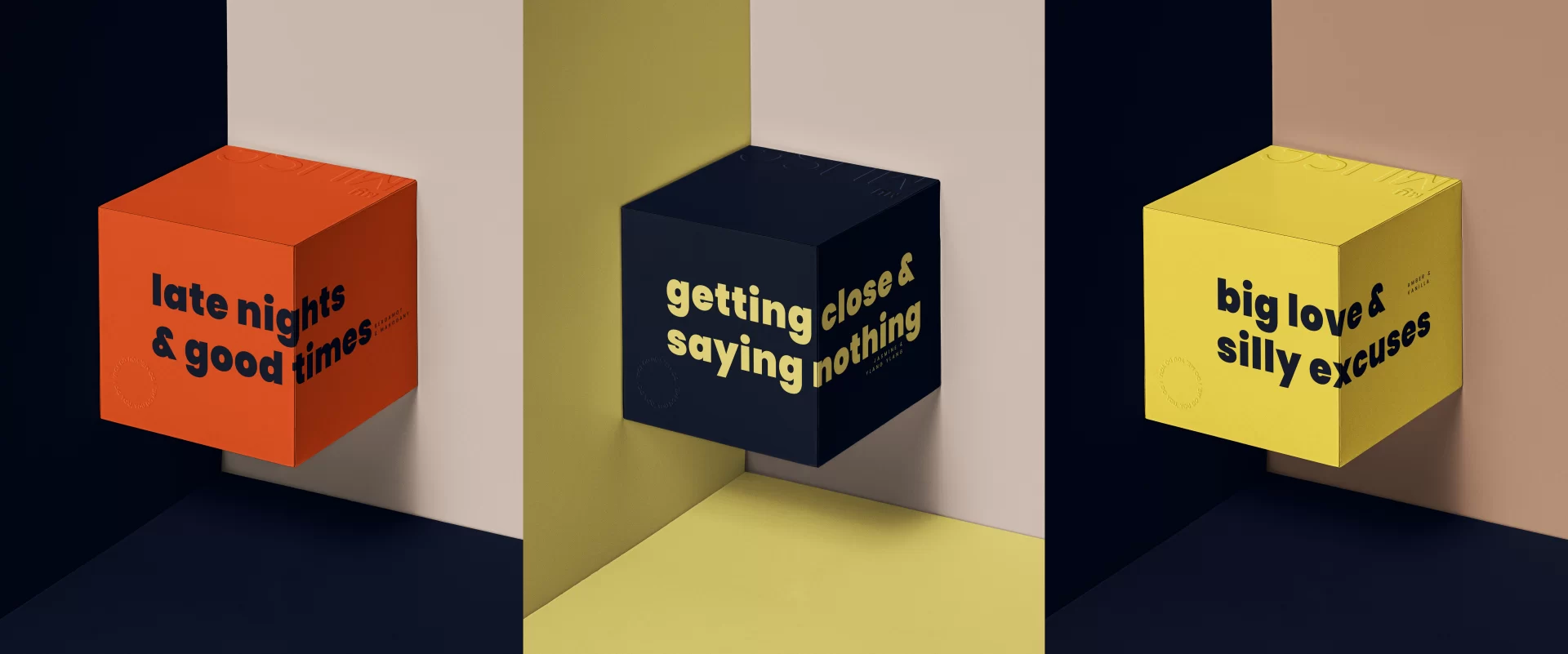
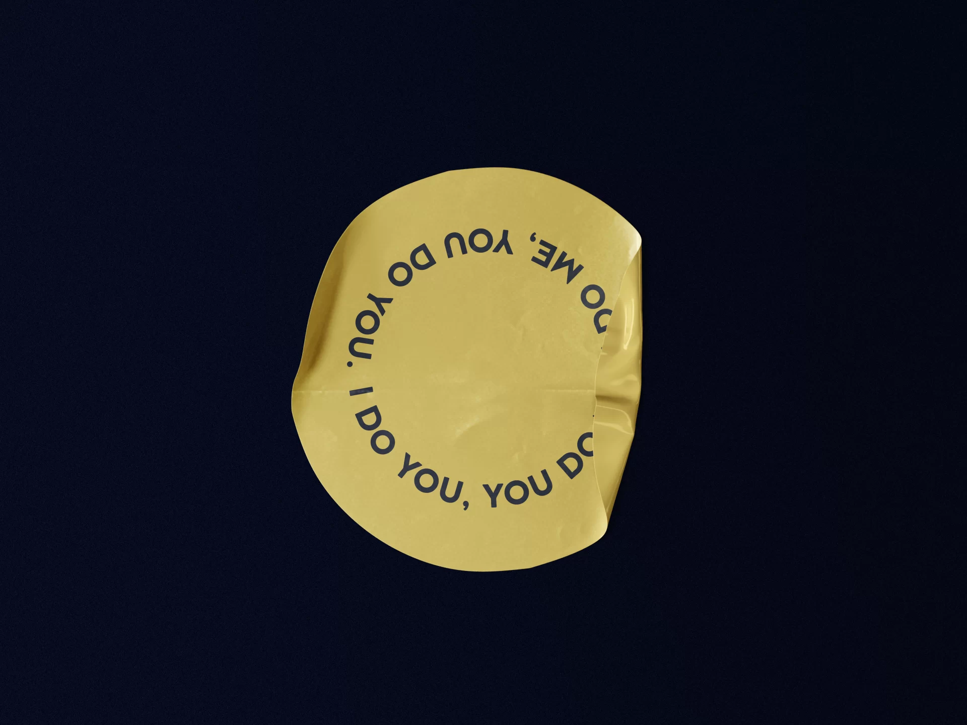
While the brand’s visual language is a loud expression over social media and promotional collaterals, the same language goes quiet and understated over the packaging. Fun and inviting boxes that someone would like to gift to a friend or a partner. Enticing packages that themselves become a cheeky gesture on their own. Objects of desire that make someone stop and smirk a little when holding it.
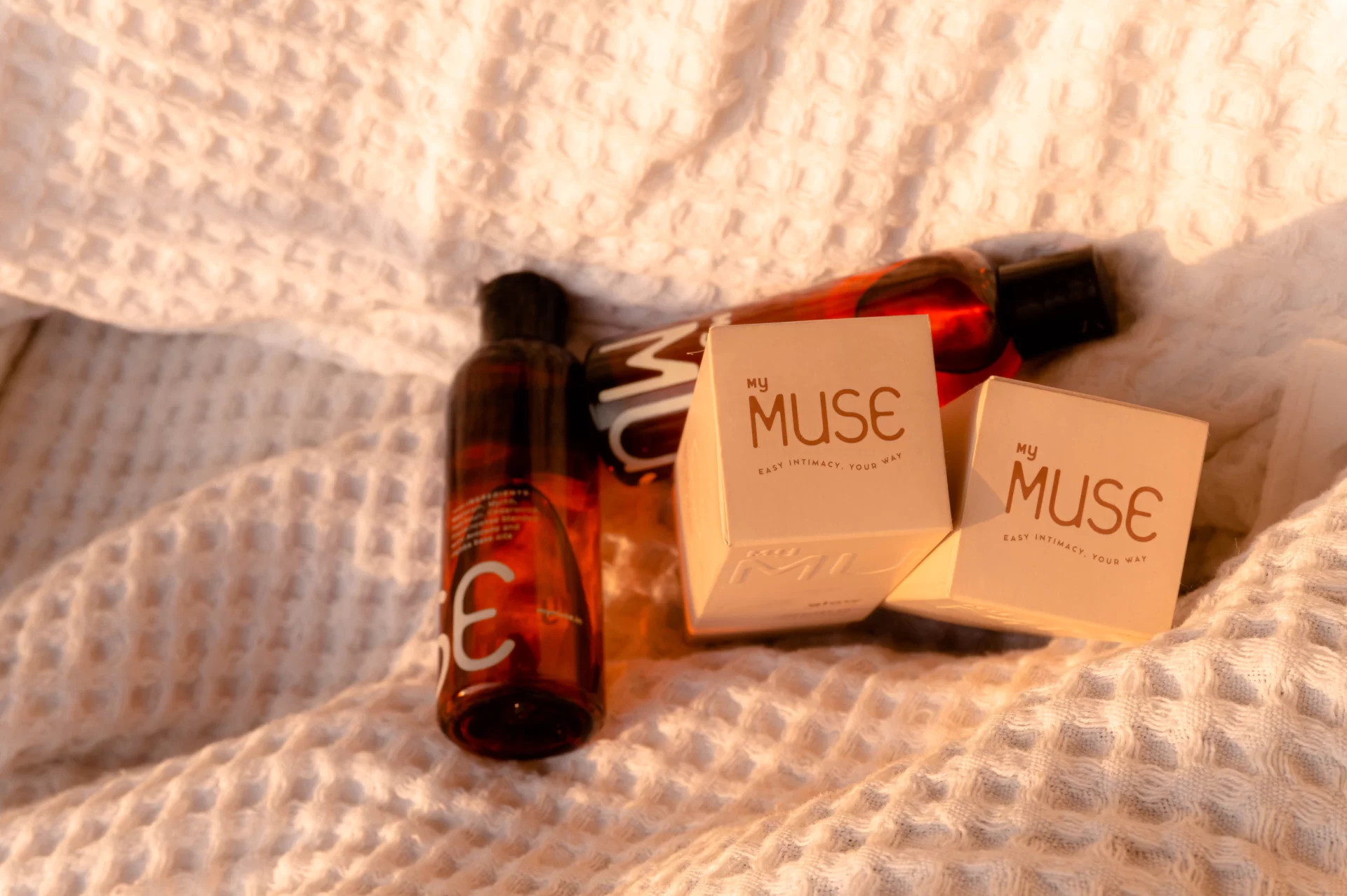
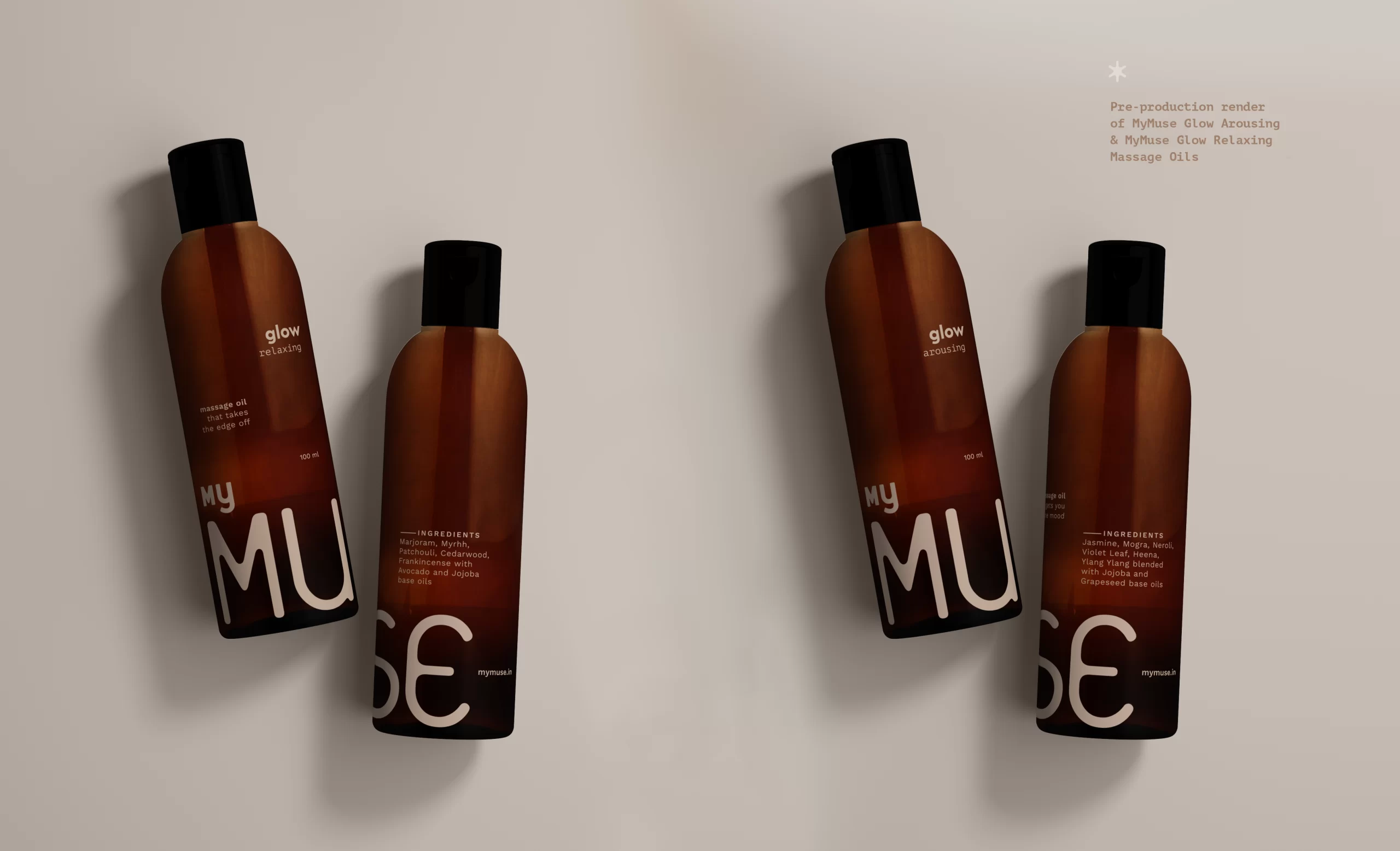
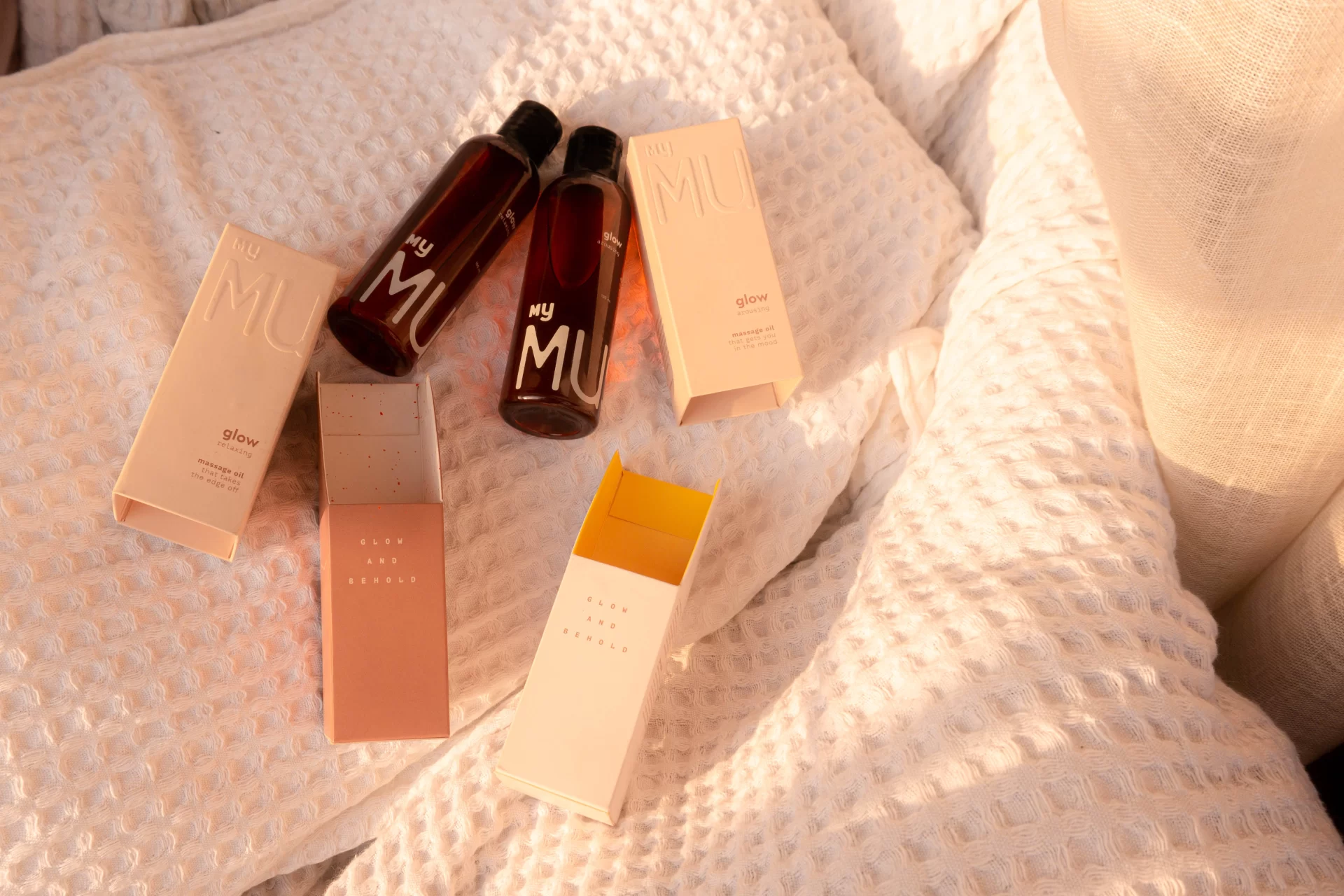
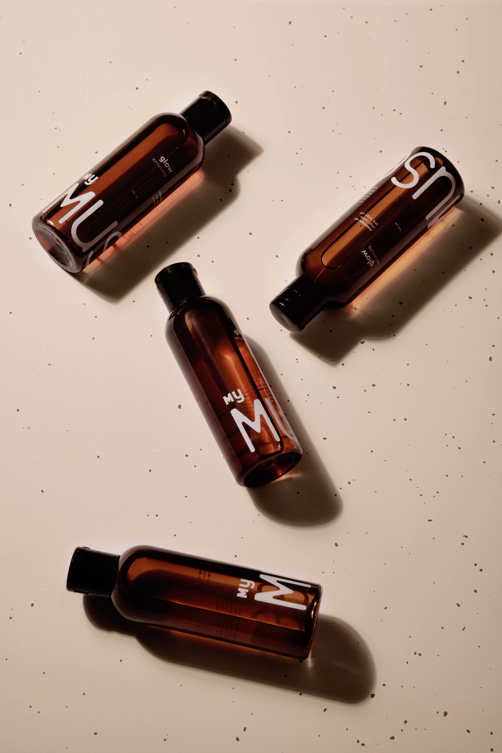
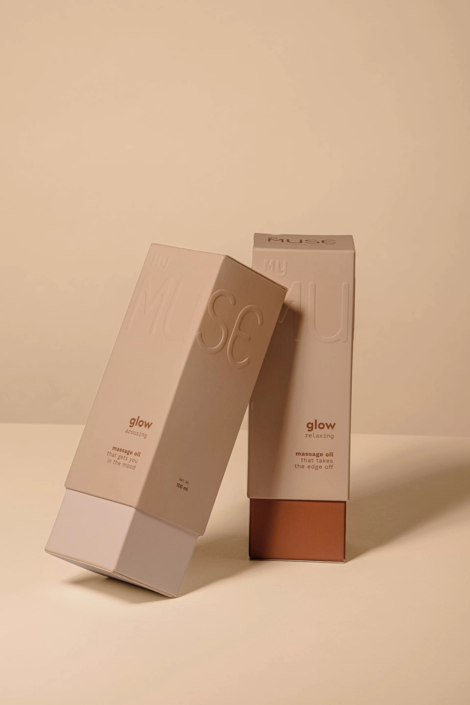
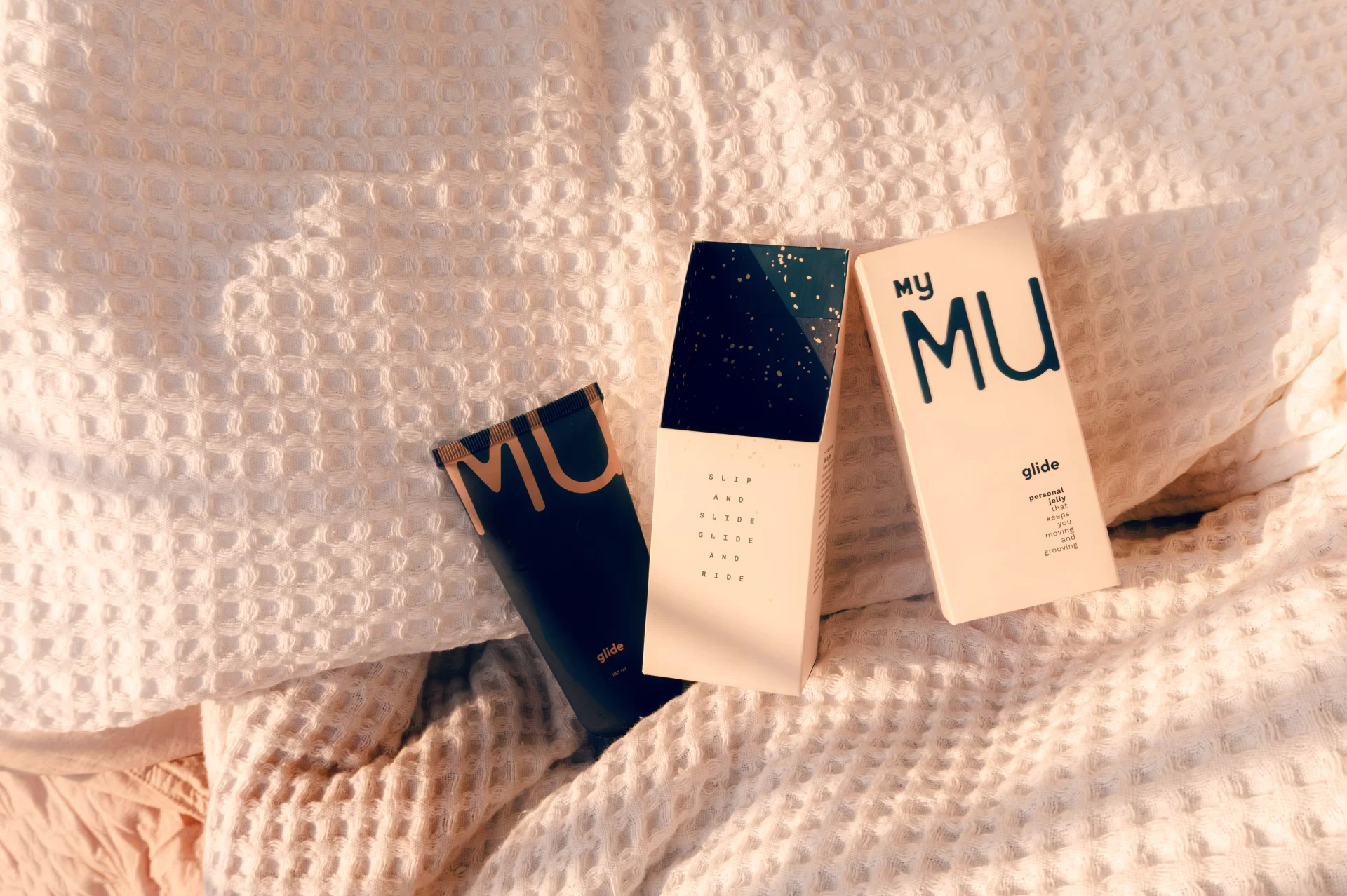
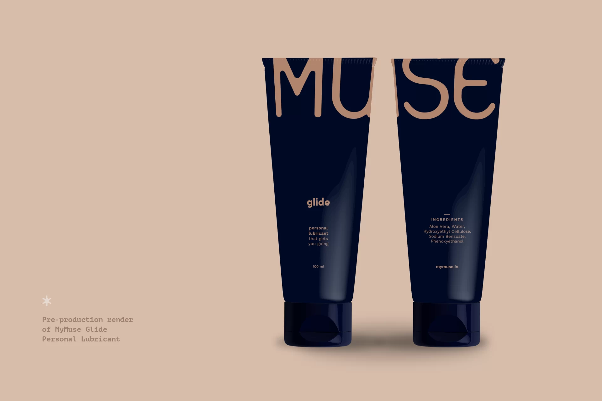
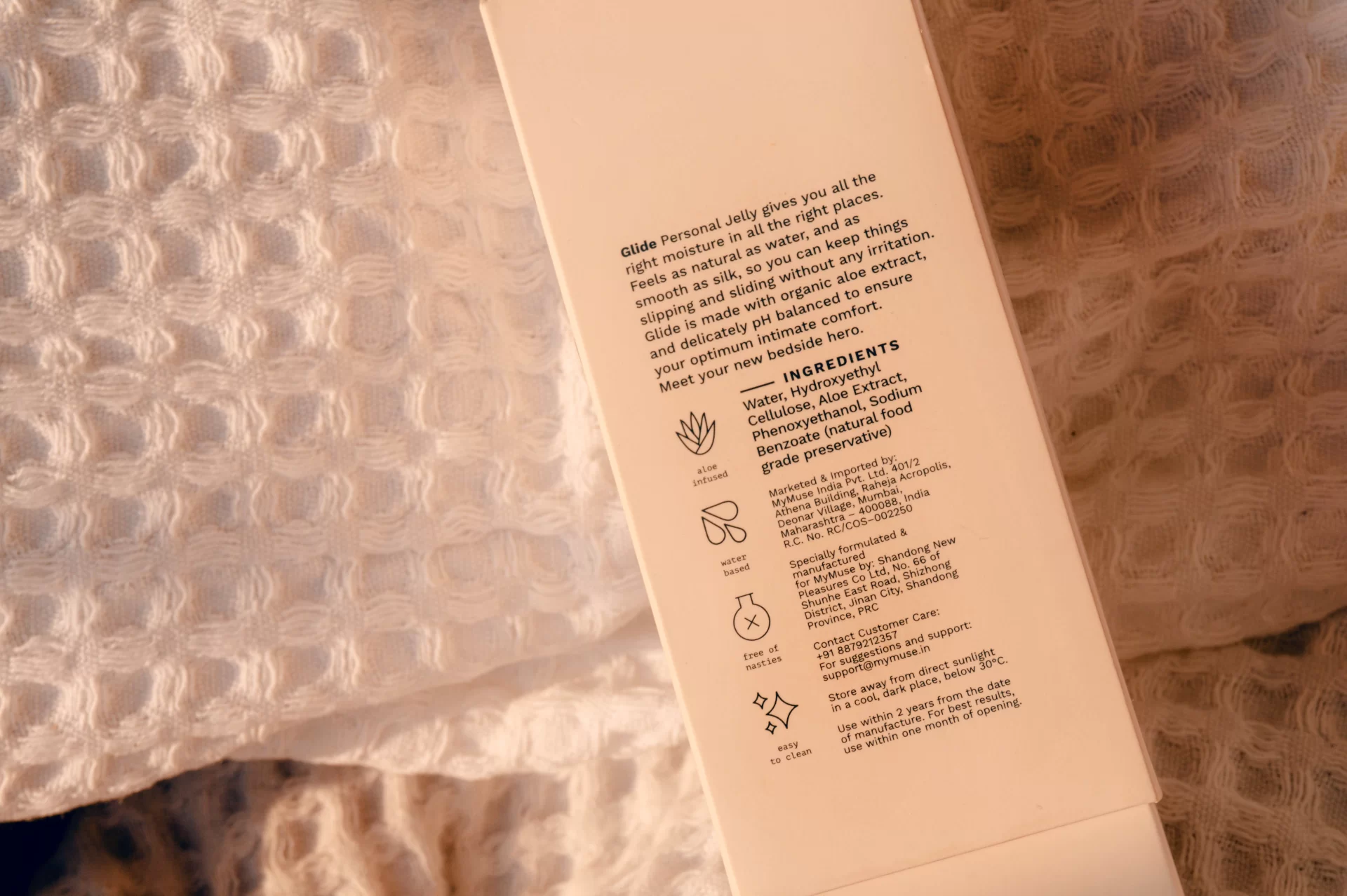
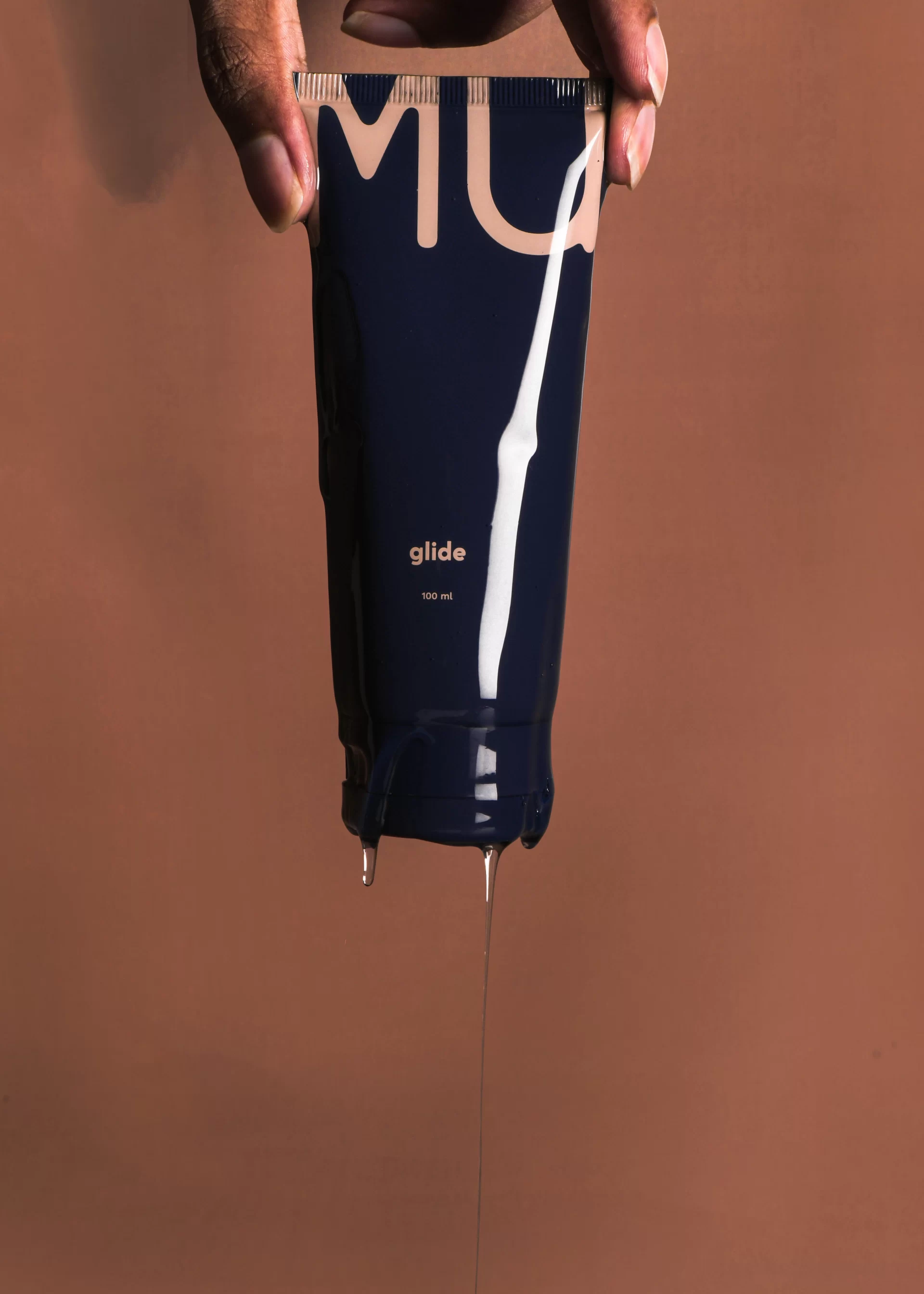
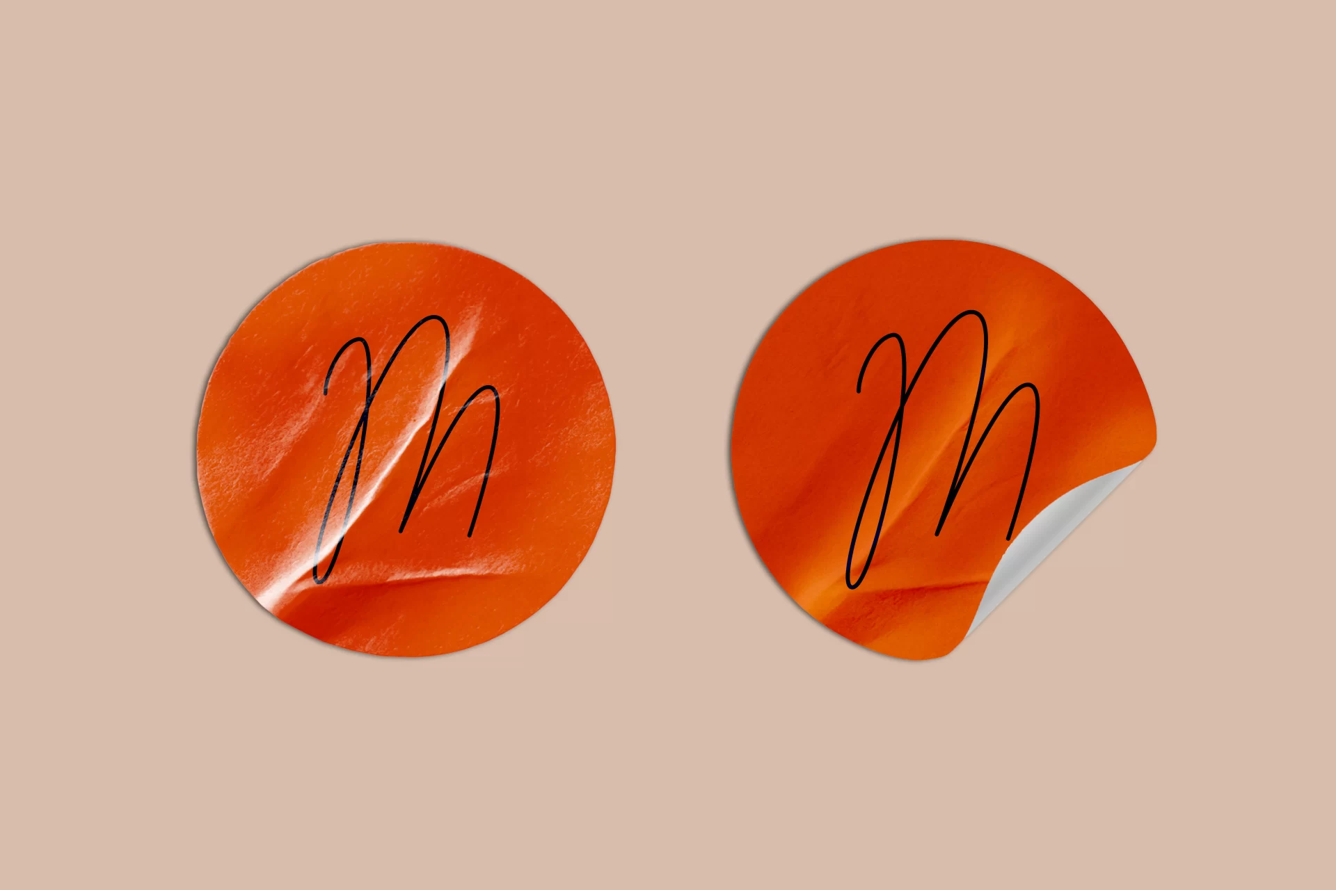
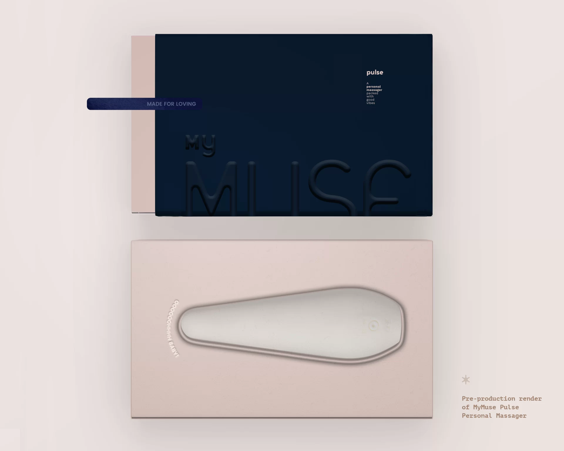
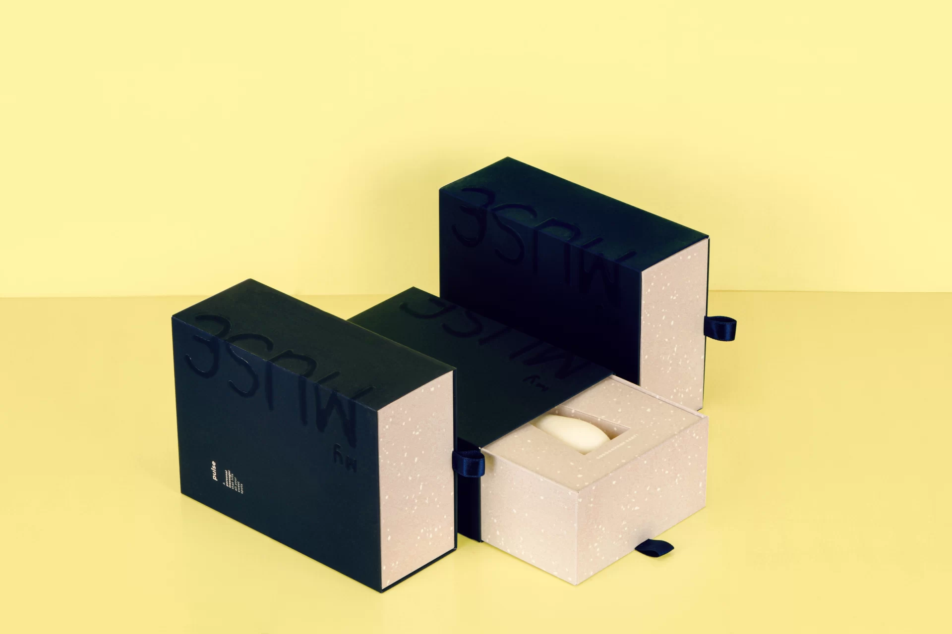
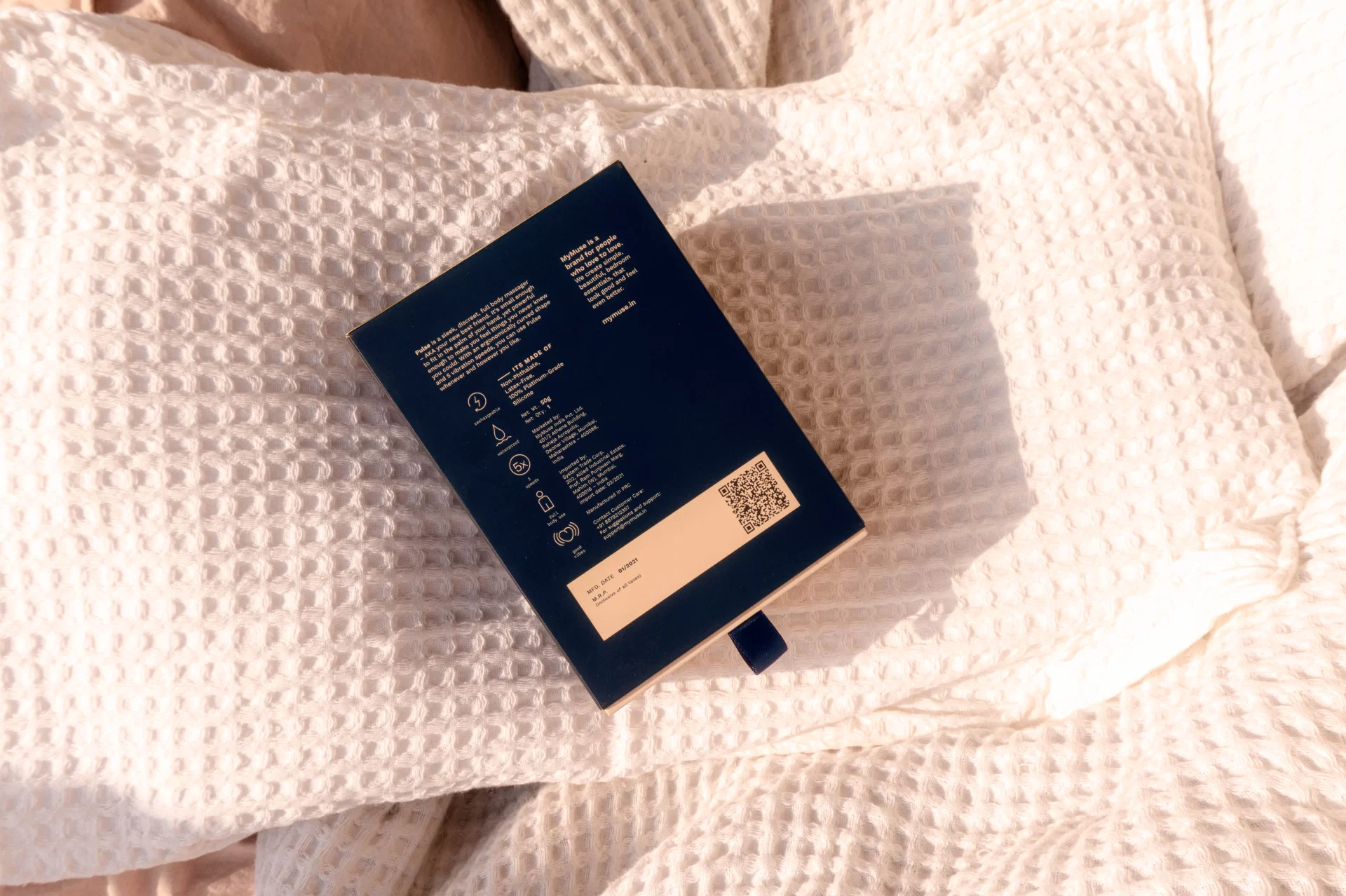
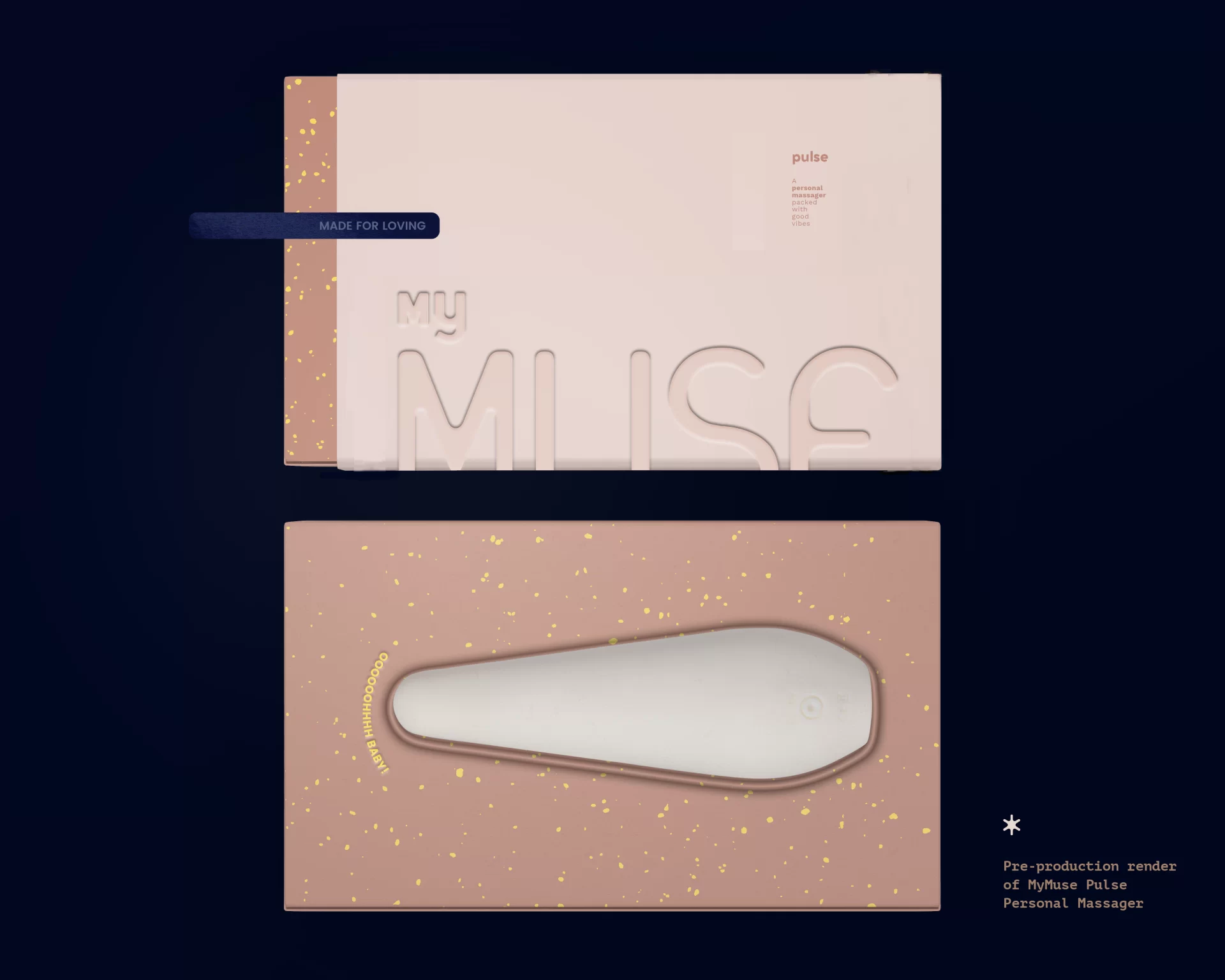
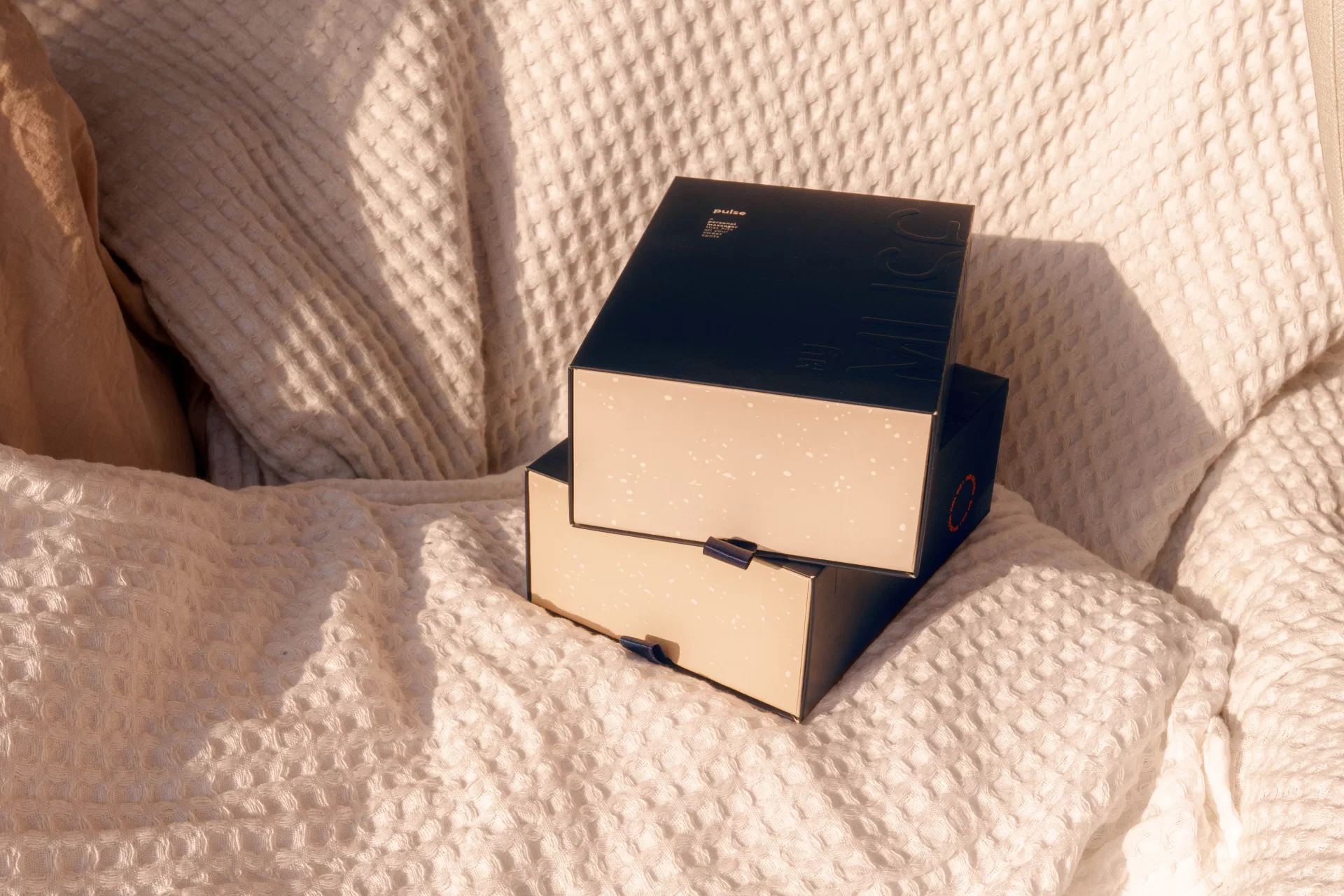
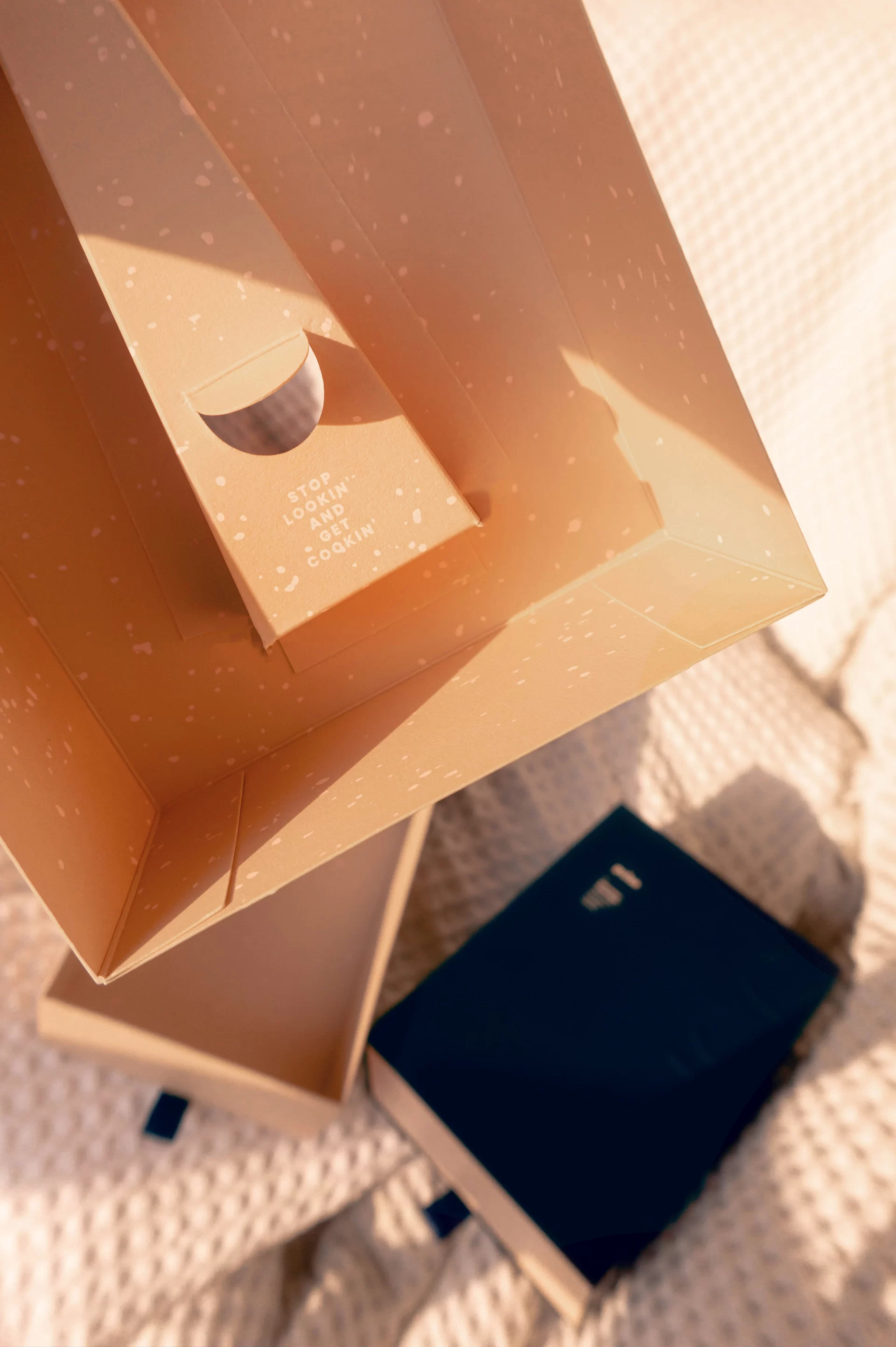
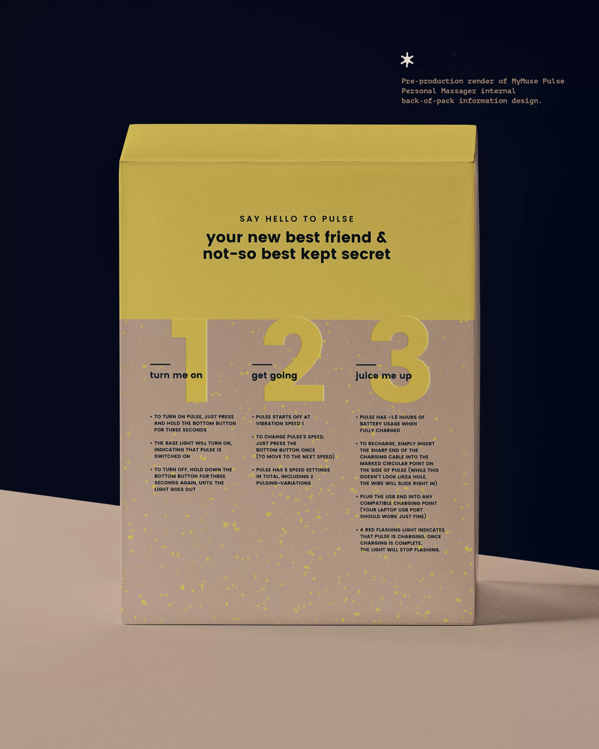
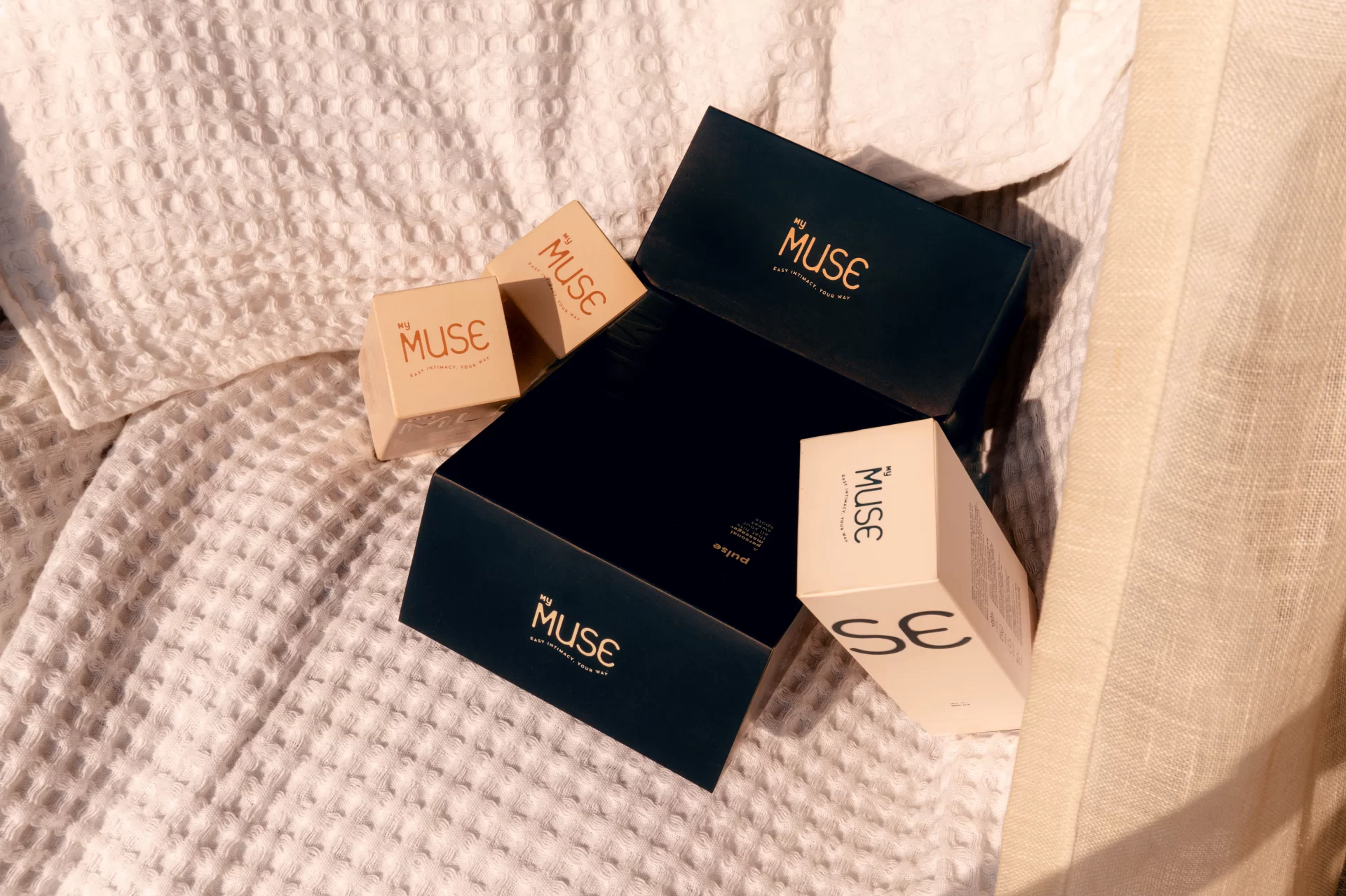
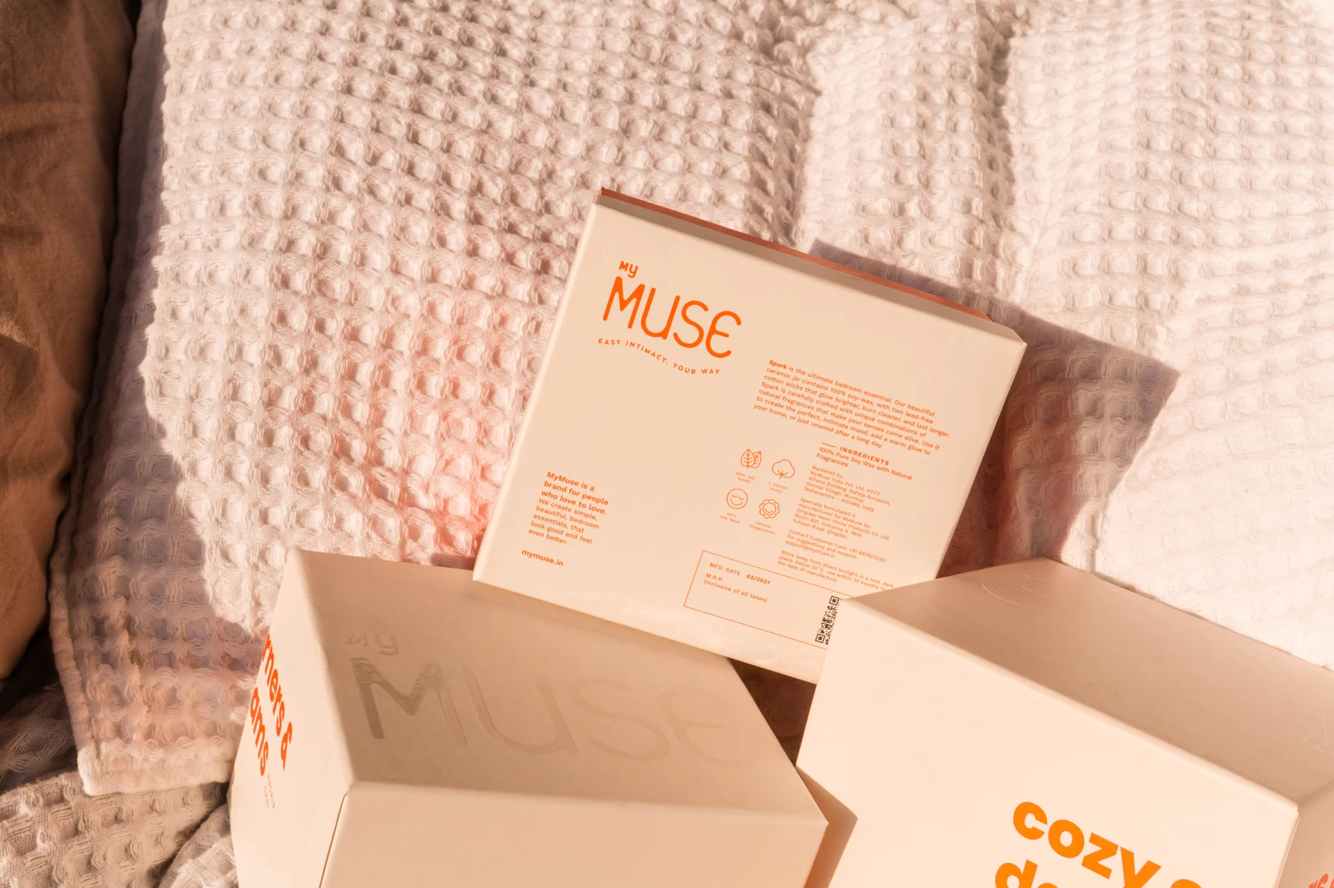
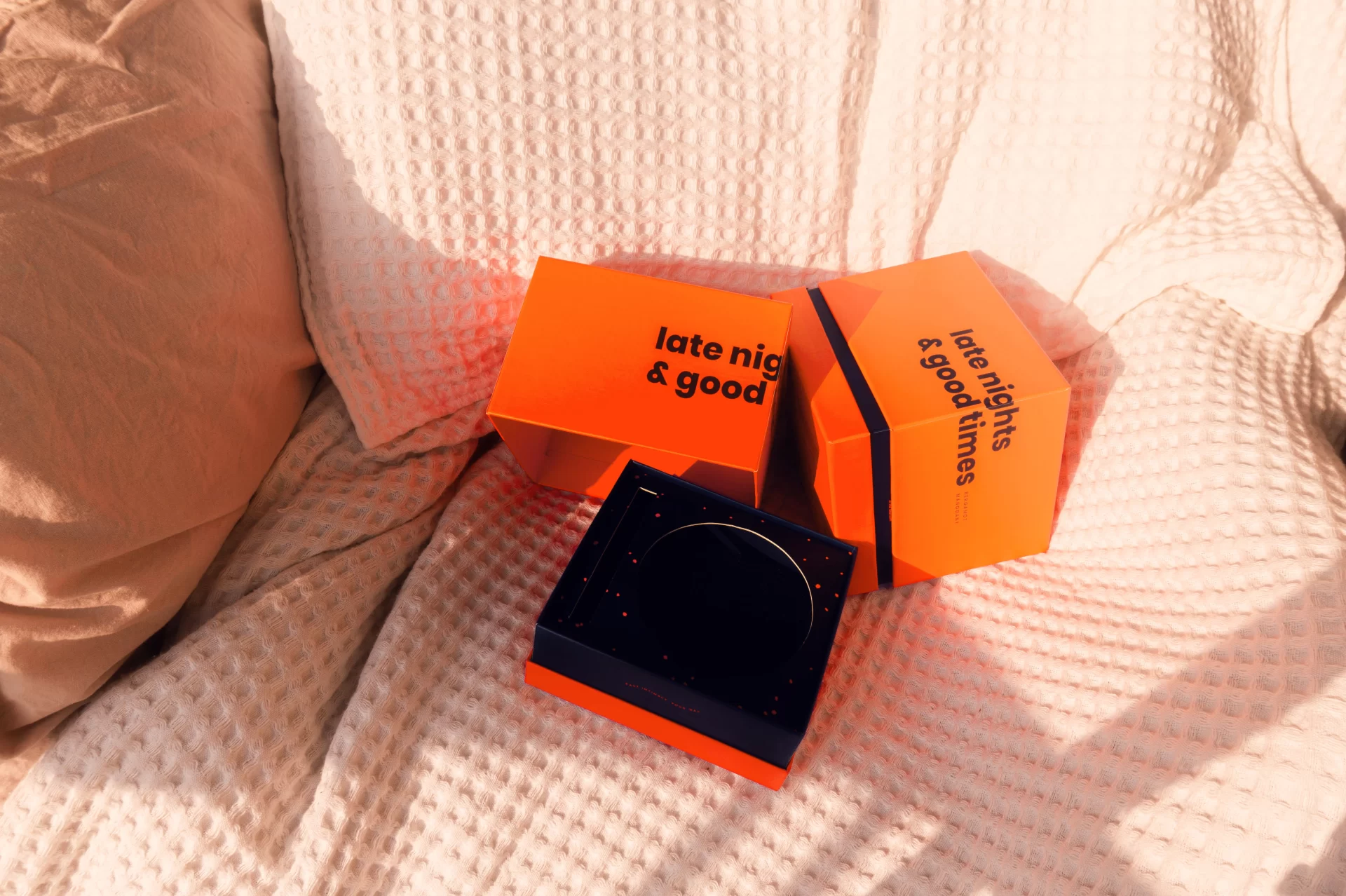
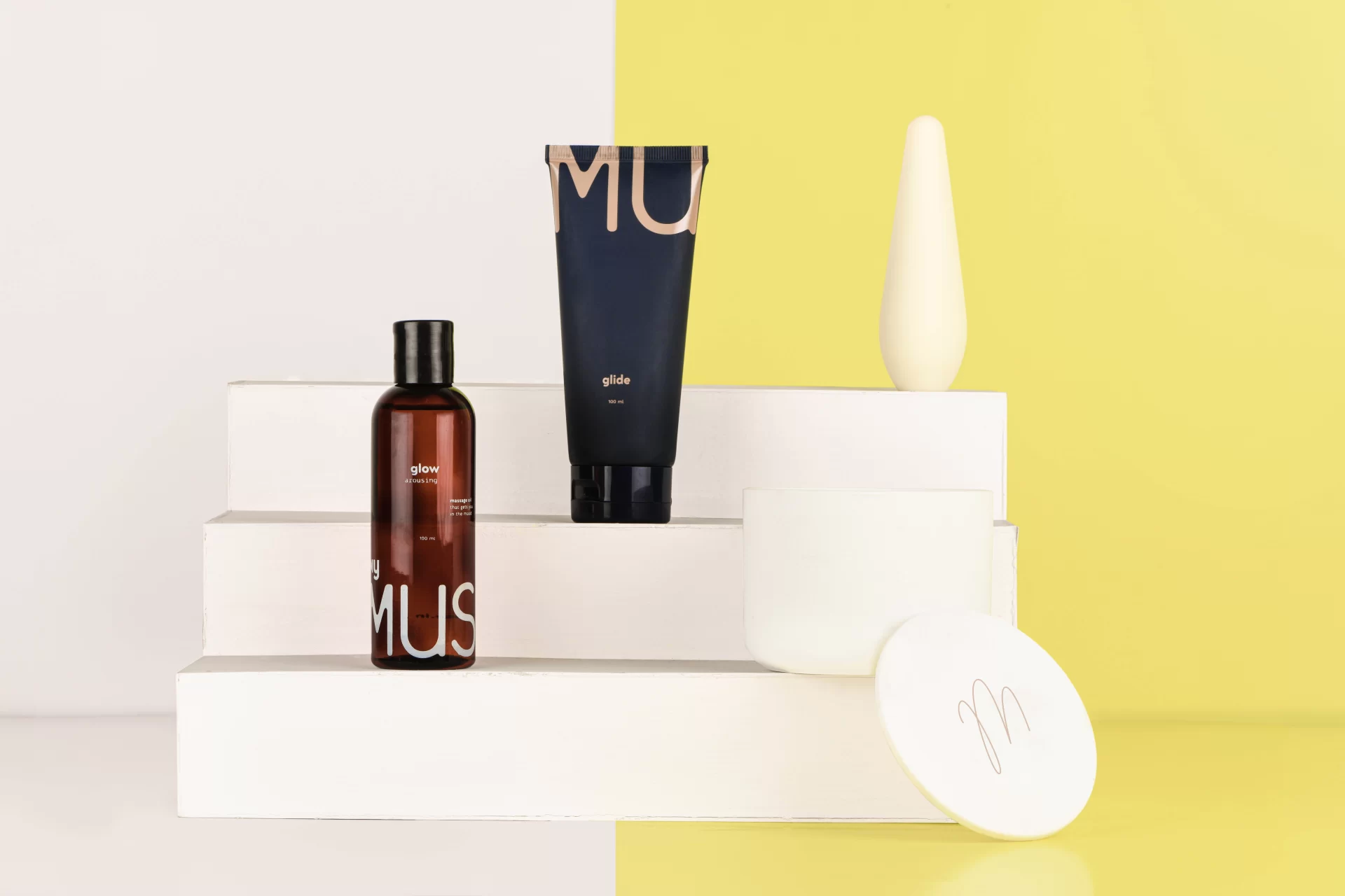
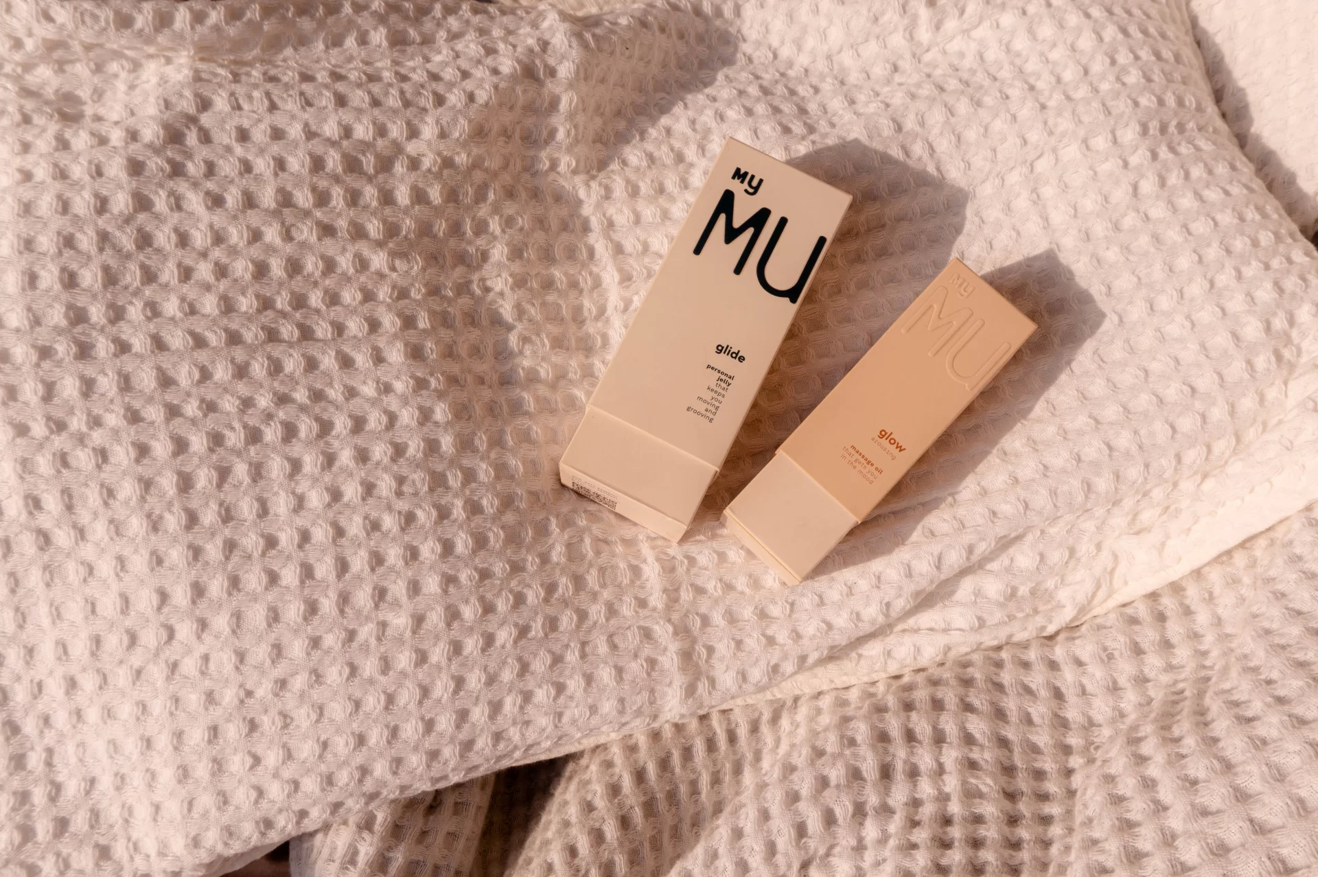
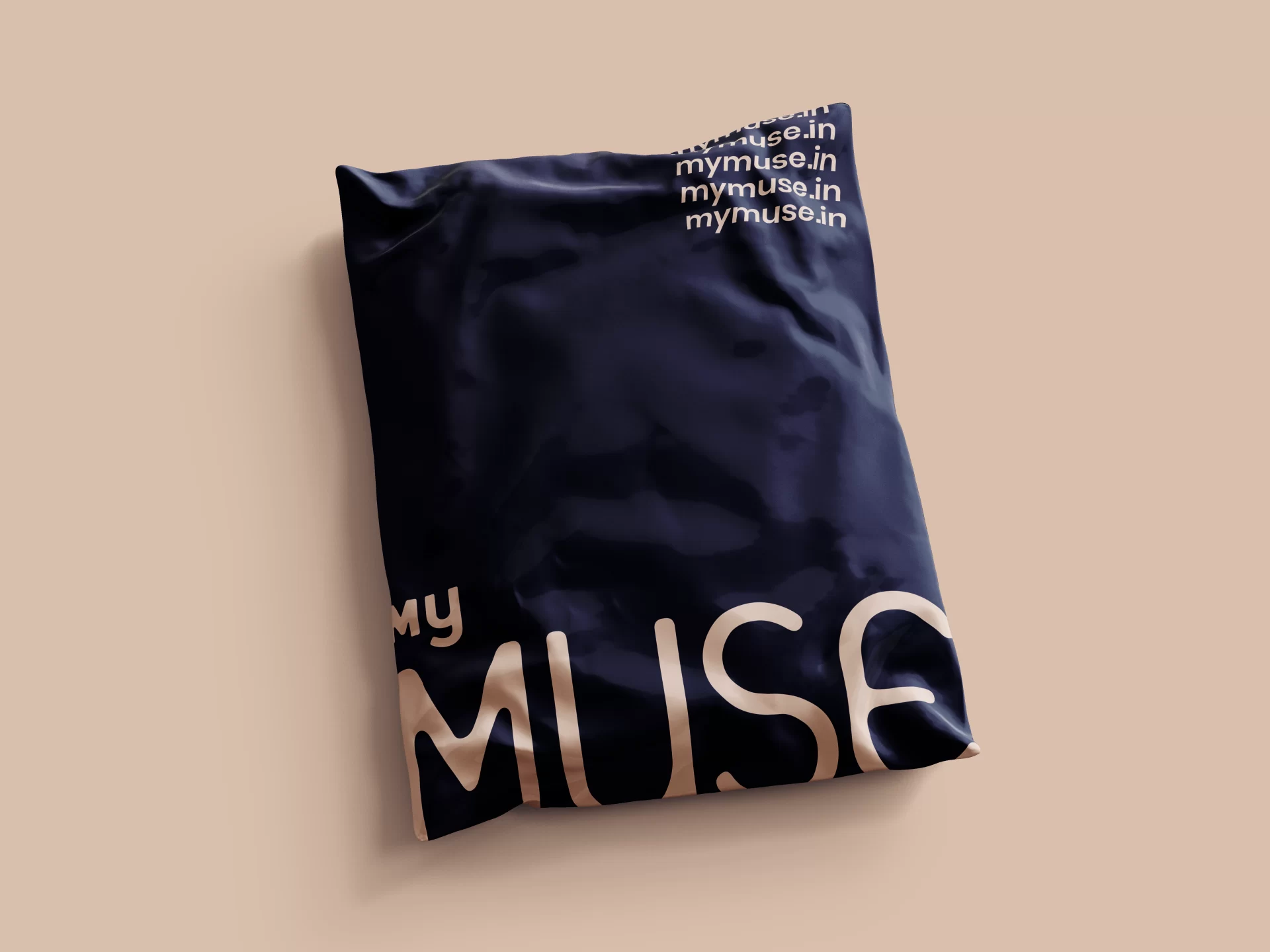
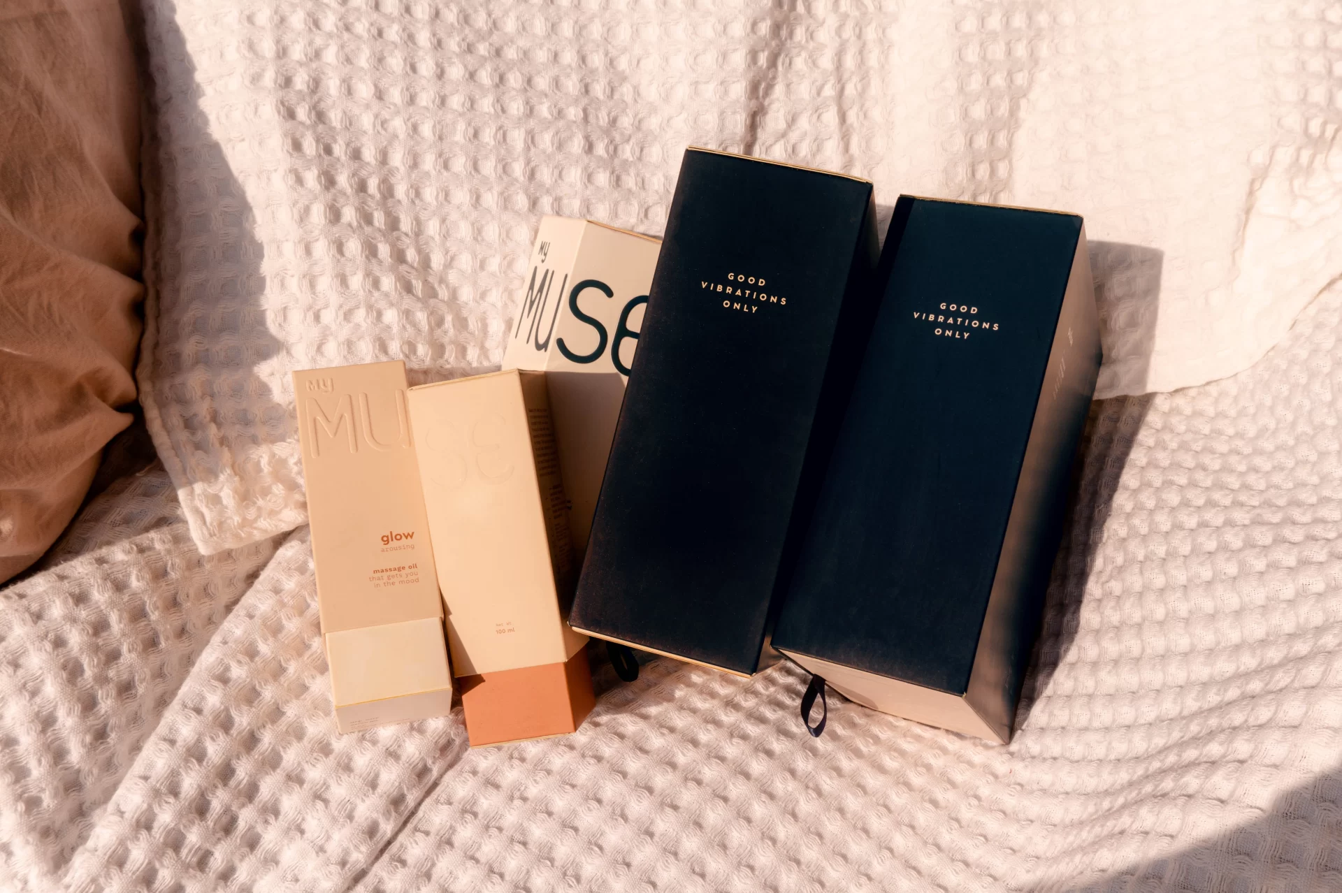
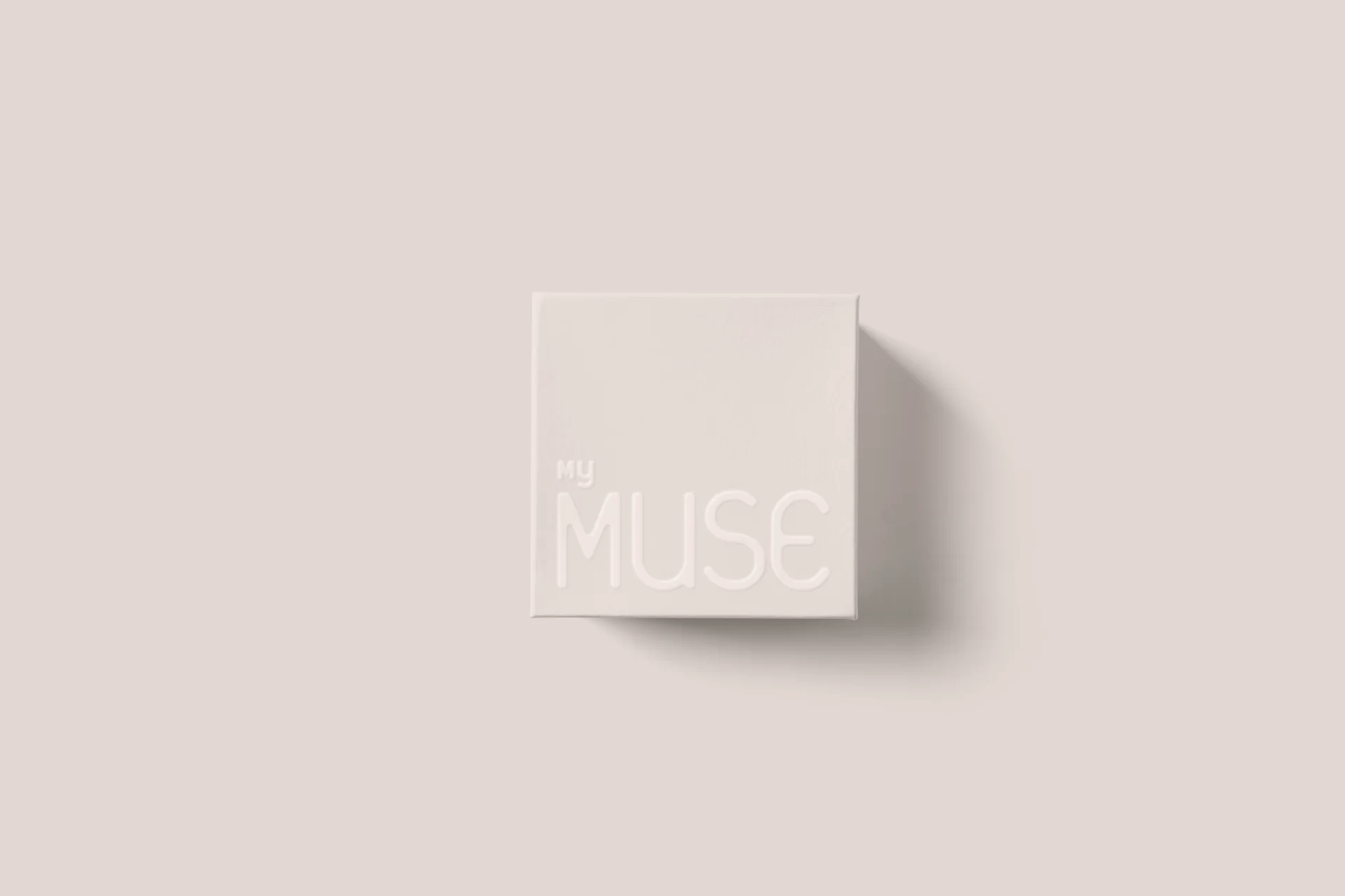
MyMuse’s primary packaging is designed to feel visually unobtrusive in the owner’s intimate spaces. Minimal design, understated colours and information that is laid out only on a need-to-know basis form the primary packaging system of MyMuse products. They are created to be just about identifiable in their function so that in the middle of the act they perform like background singers. That way the products may set fire to the rain, but they will never steal your thunder.
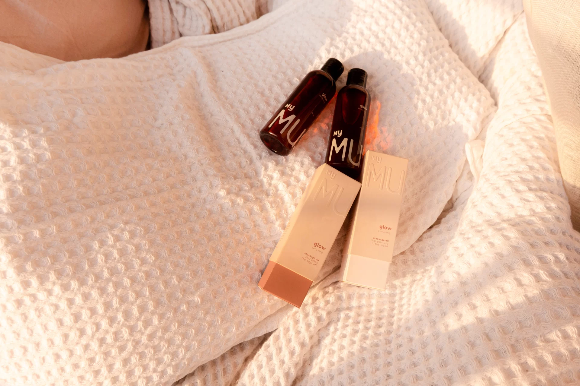
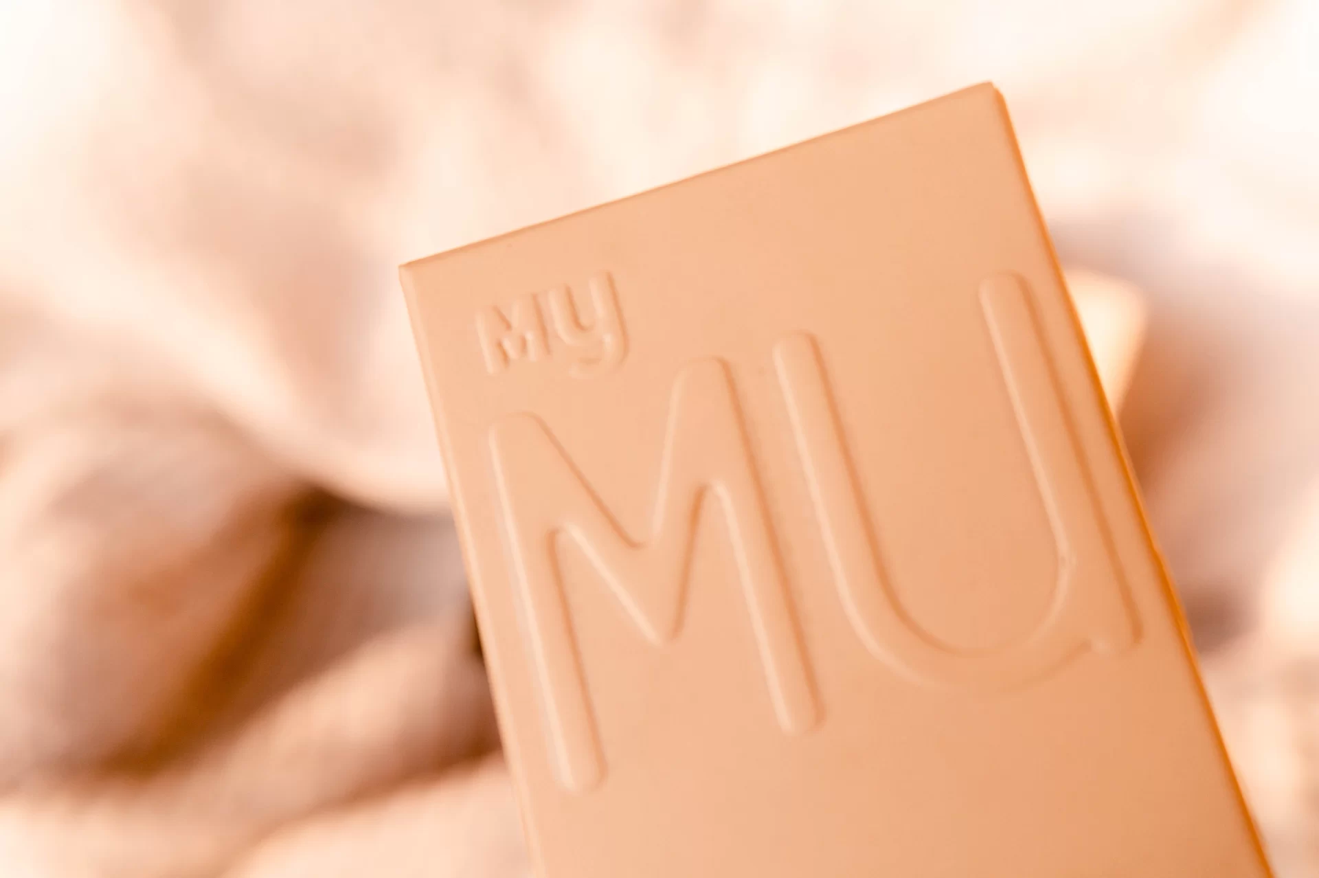
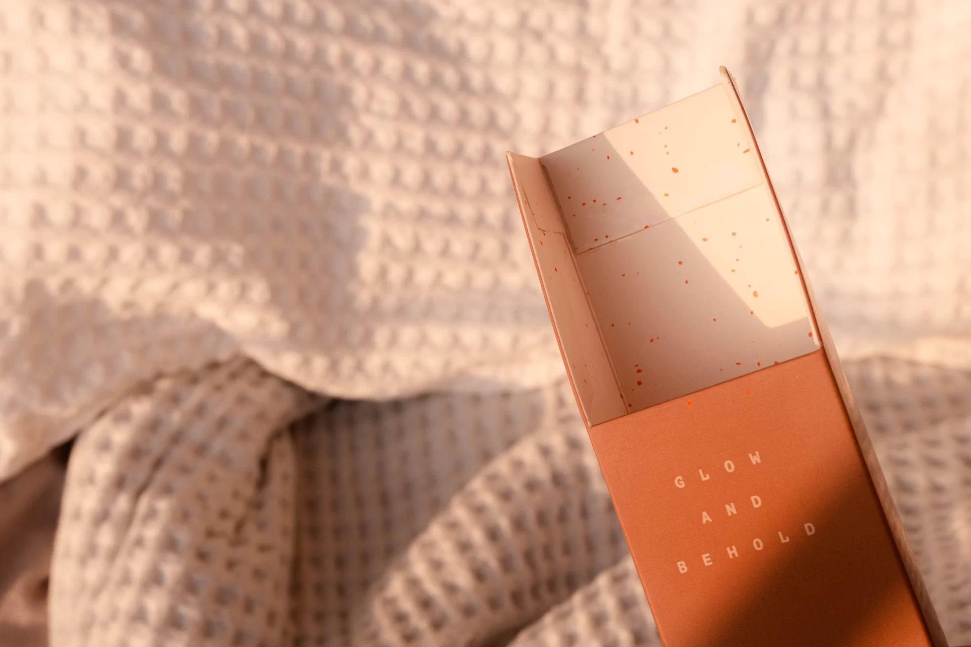
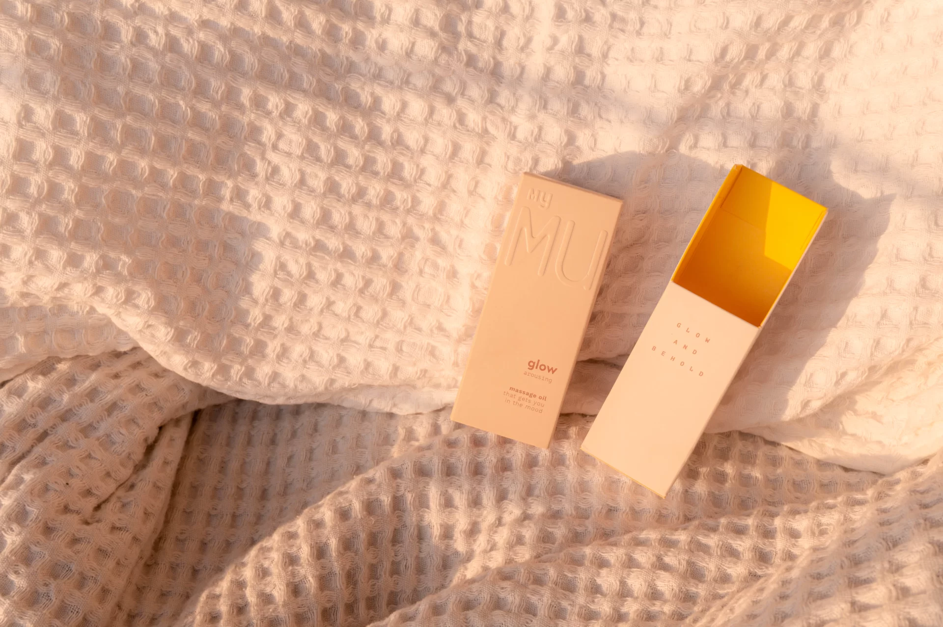
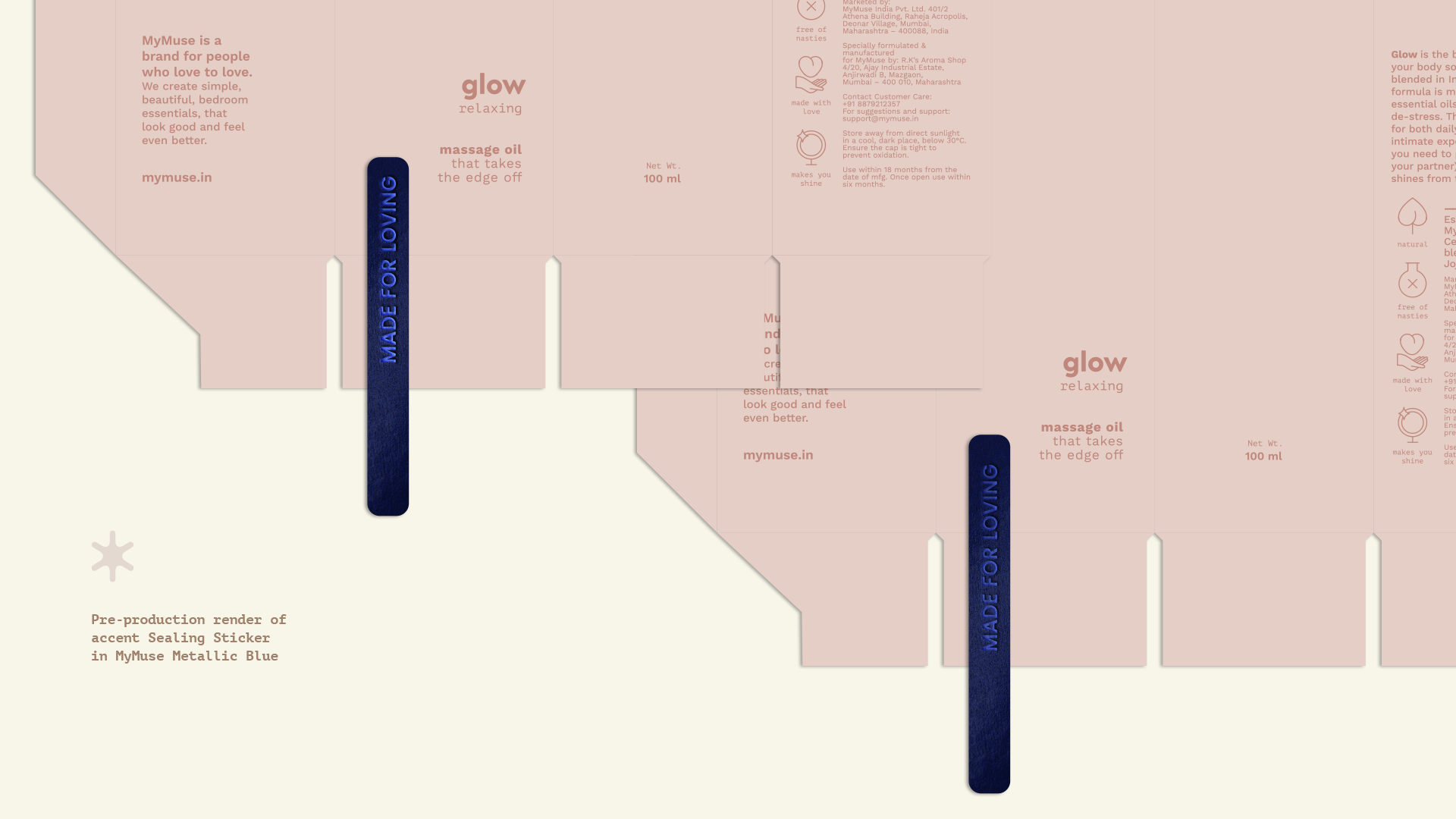
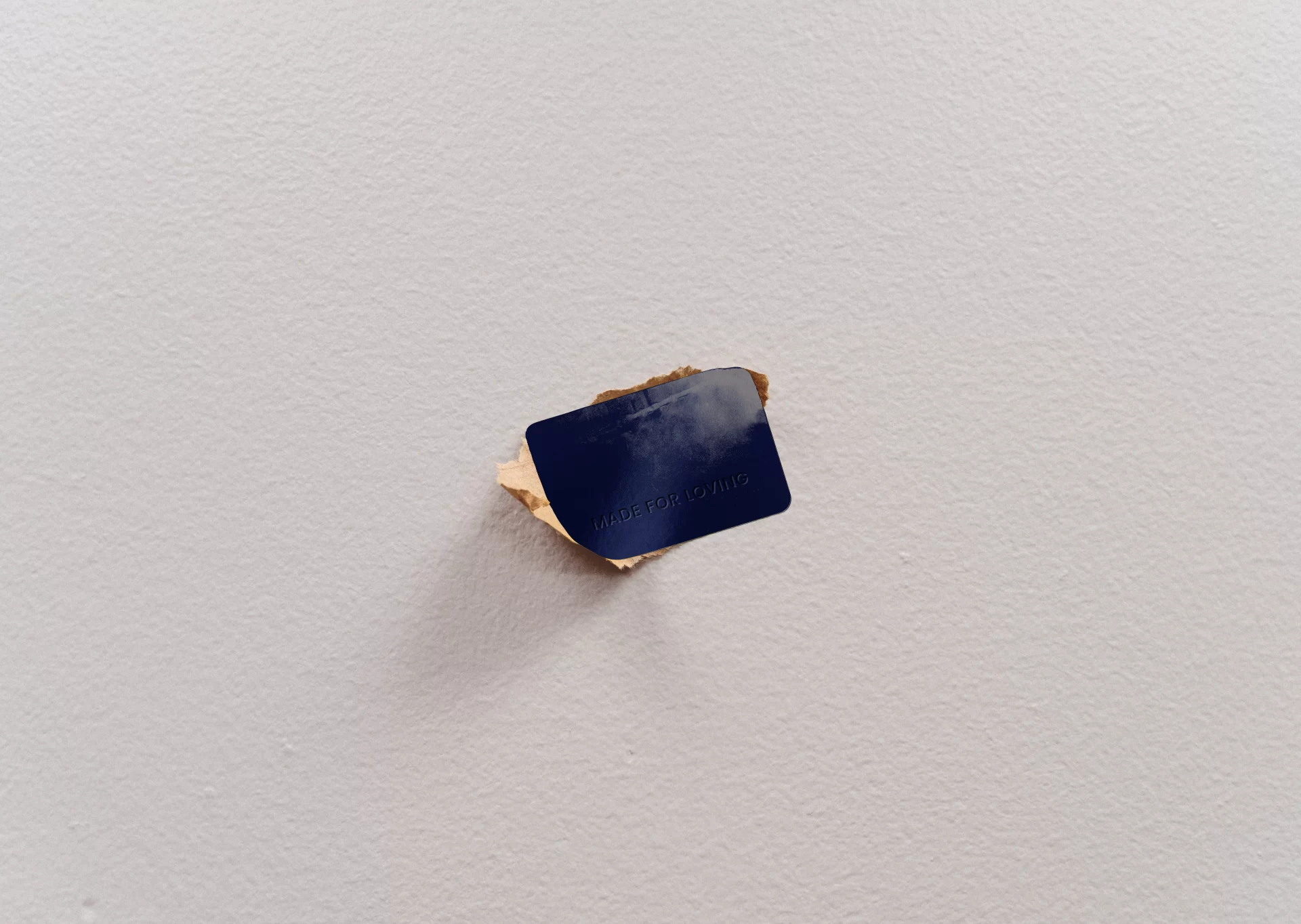
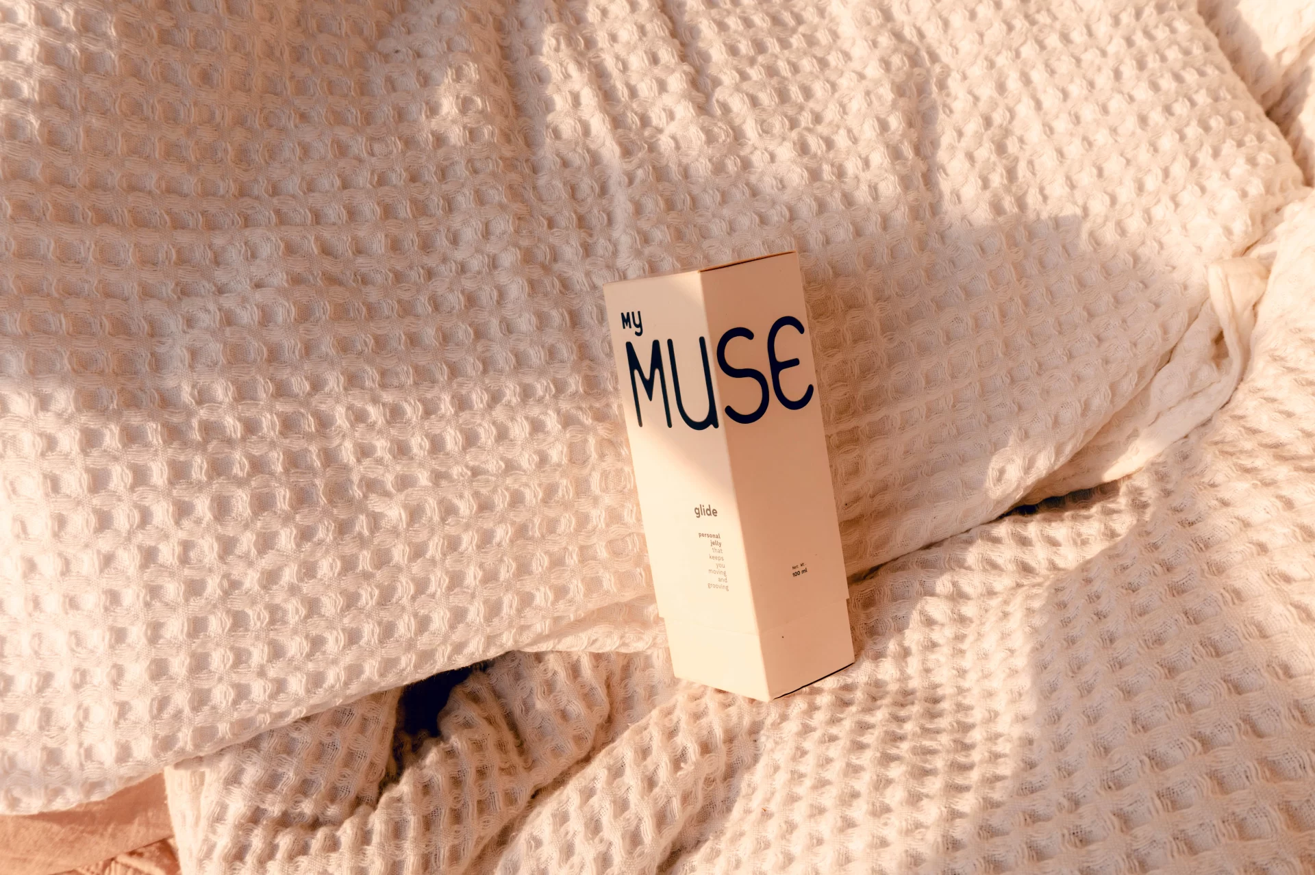
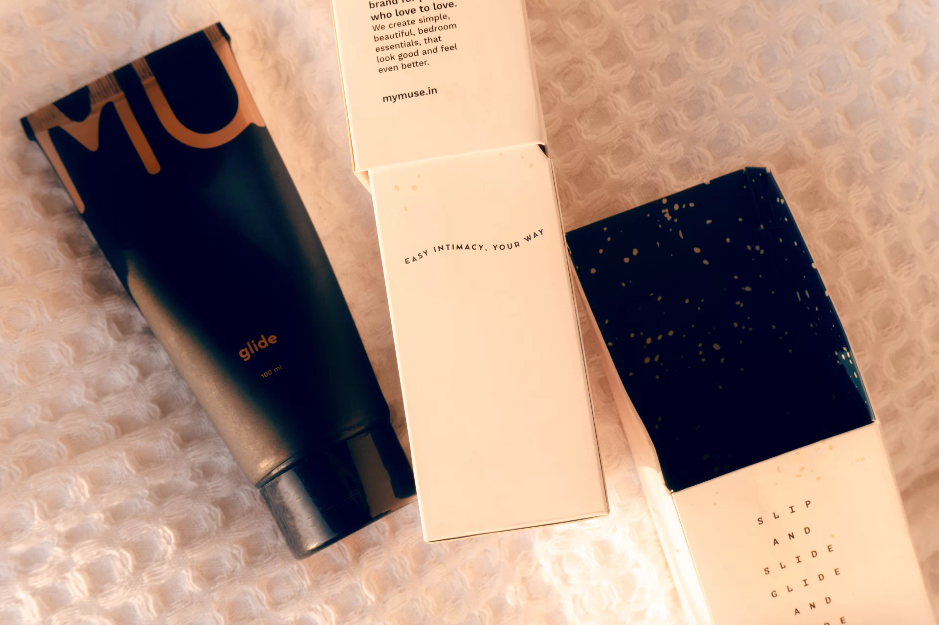
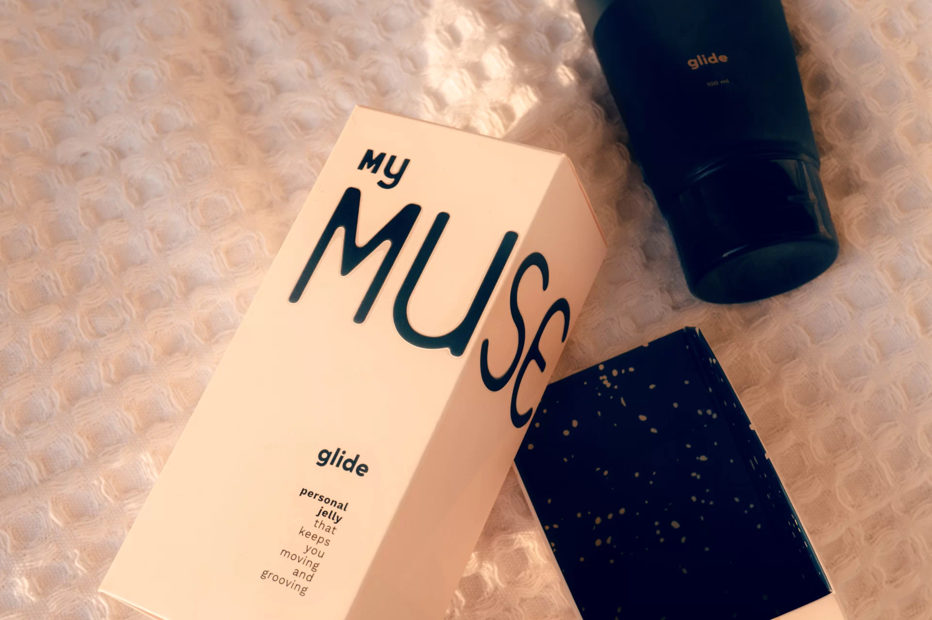
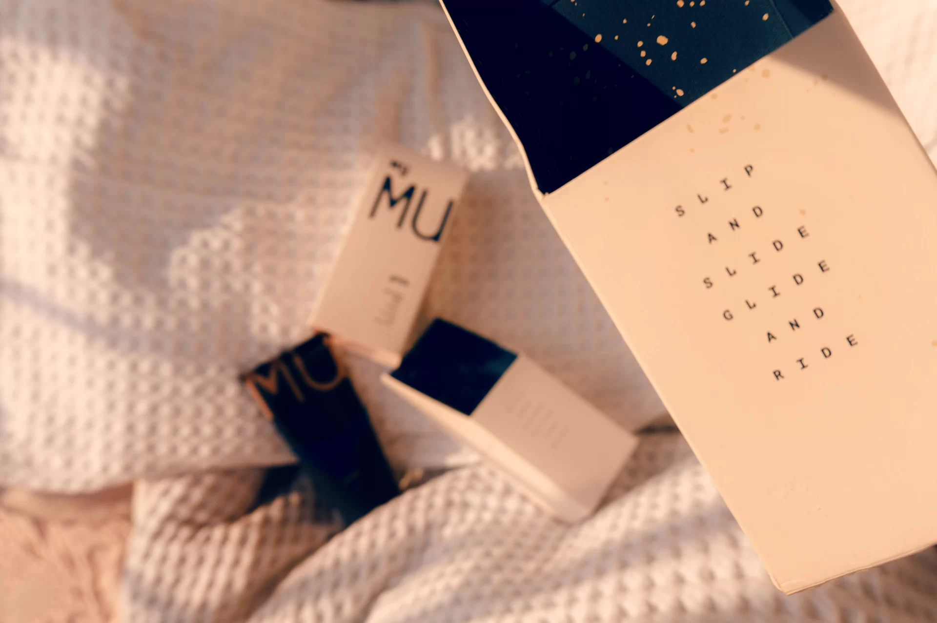
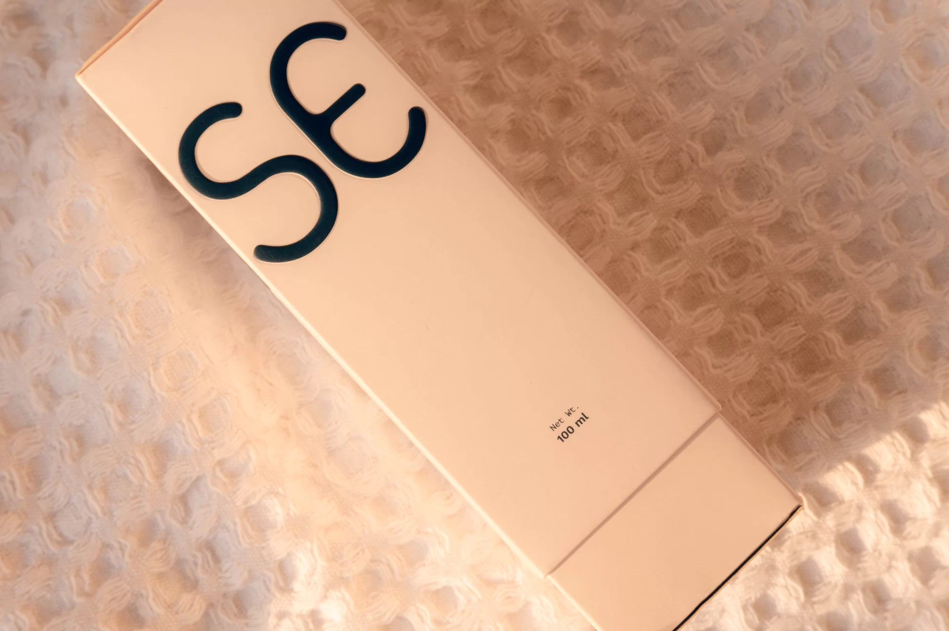
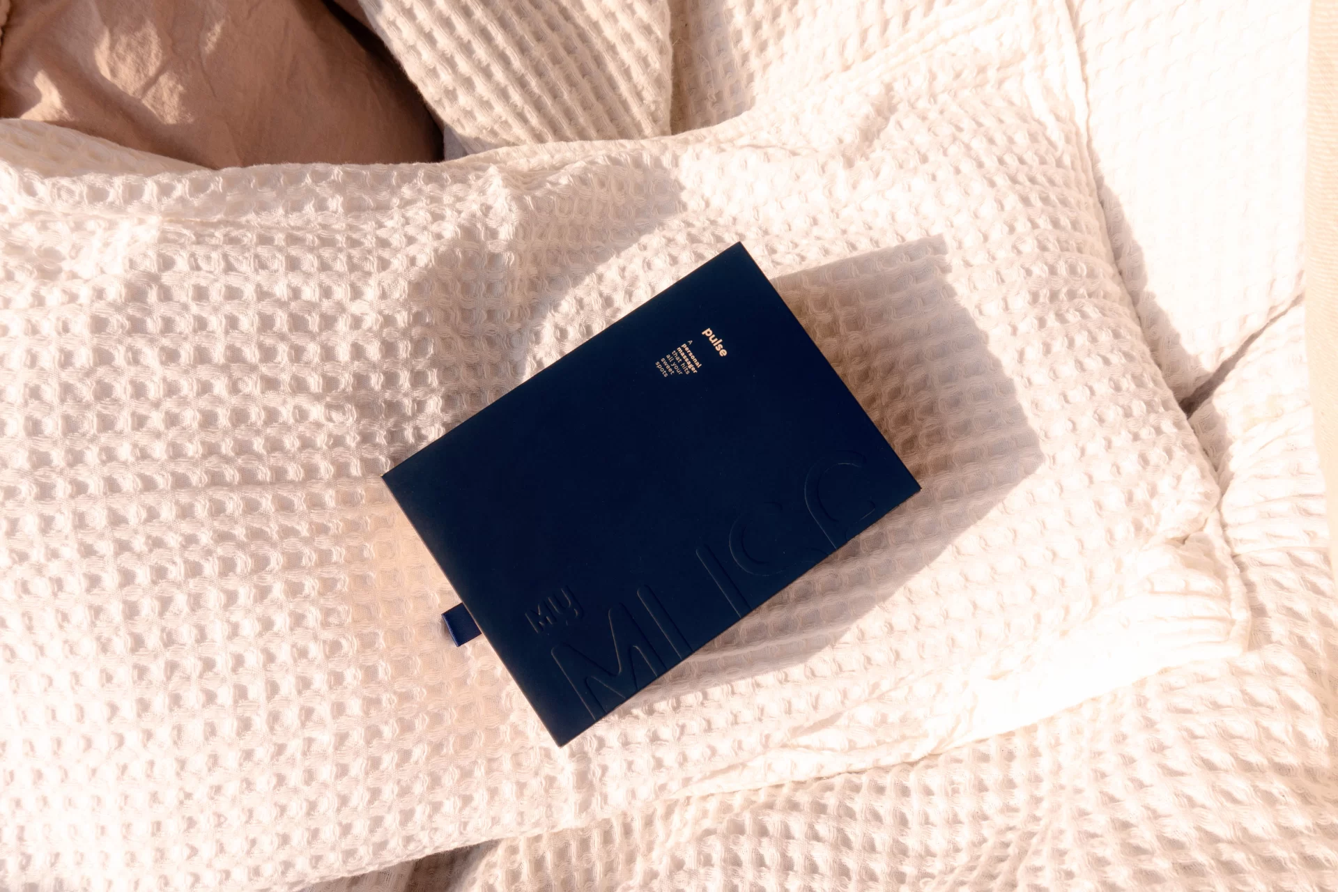
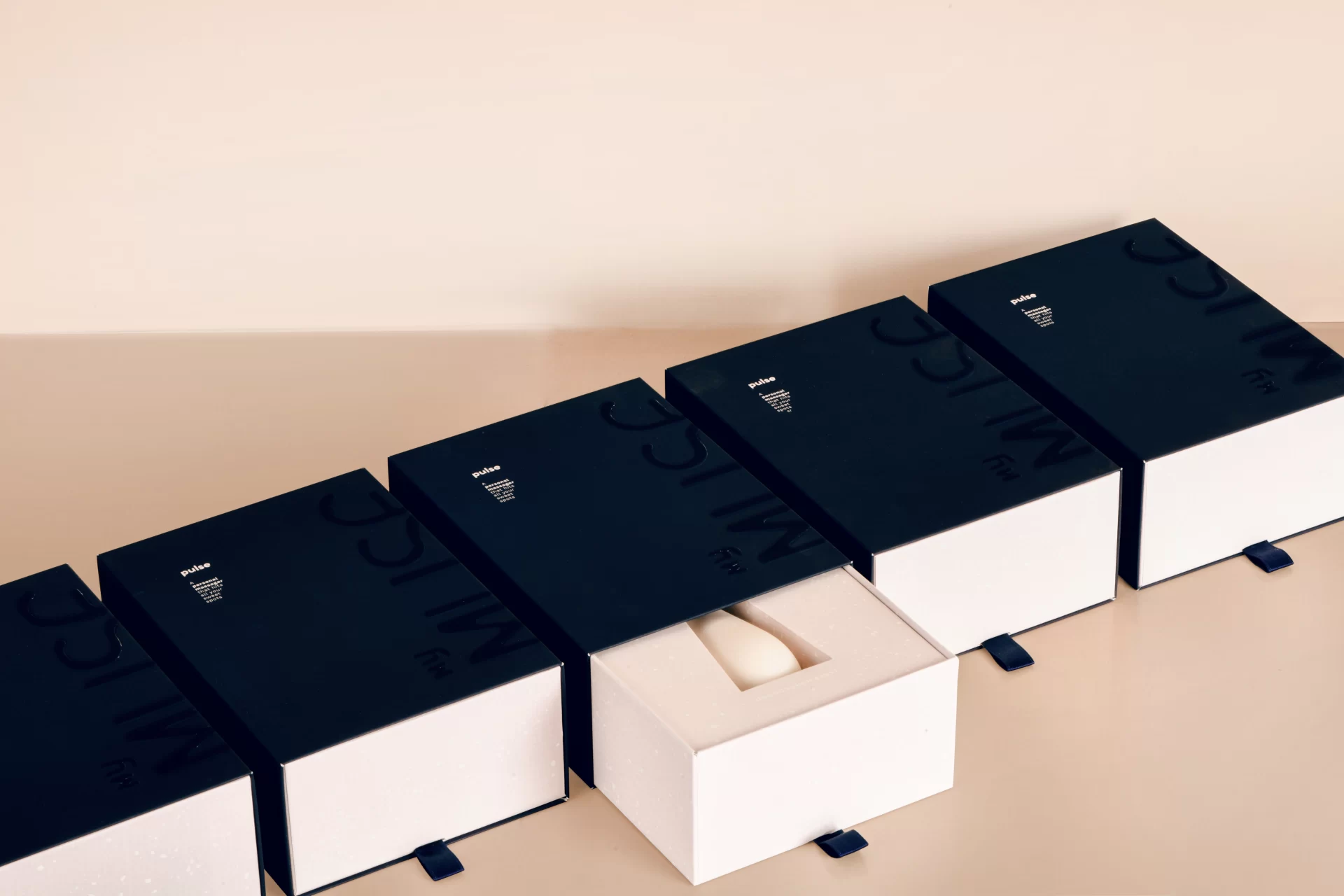
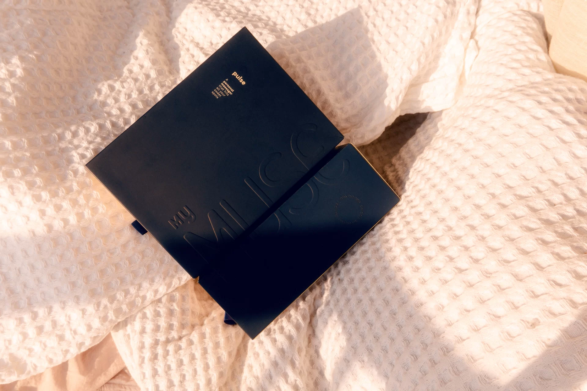
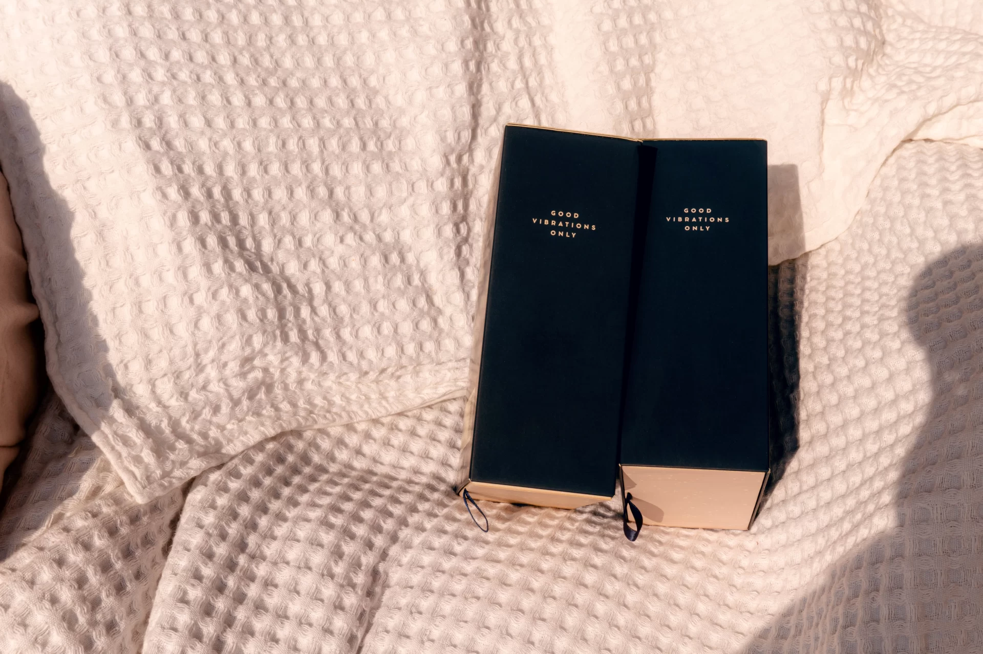
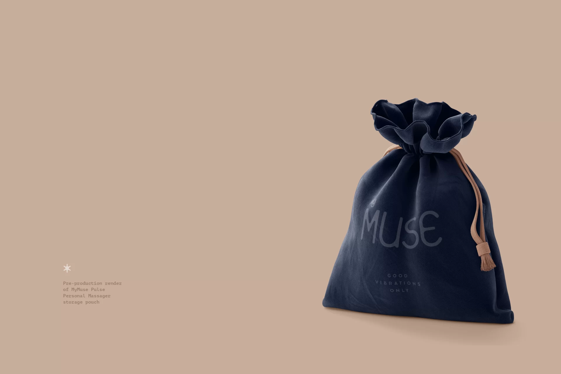
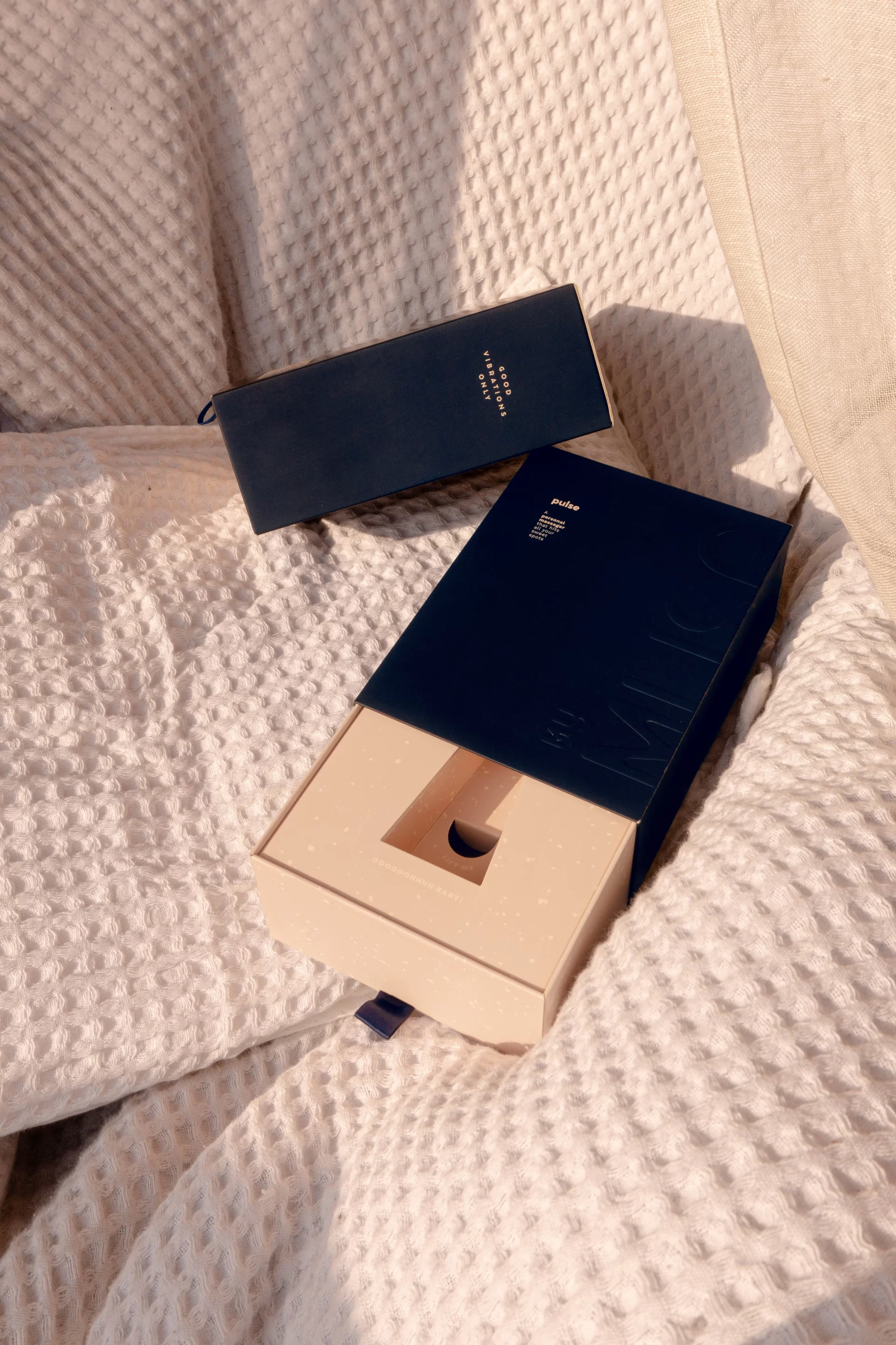
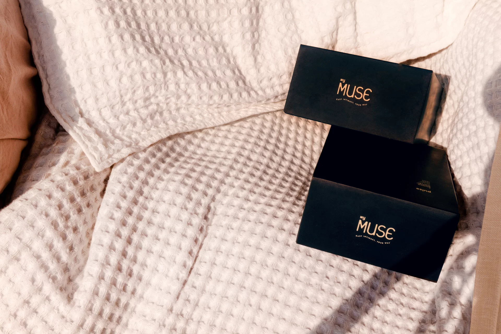
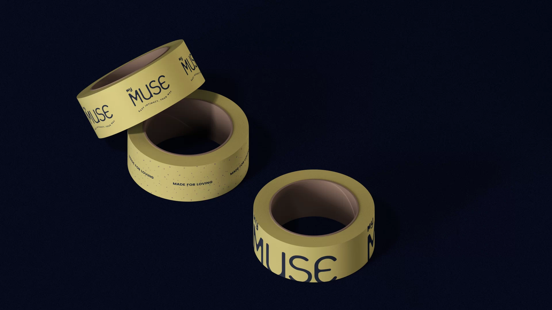
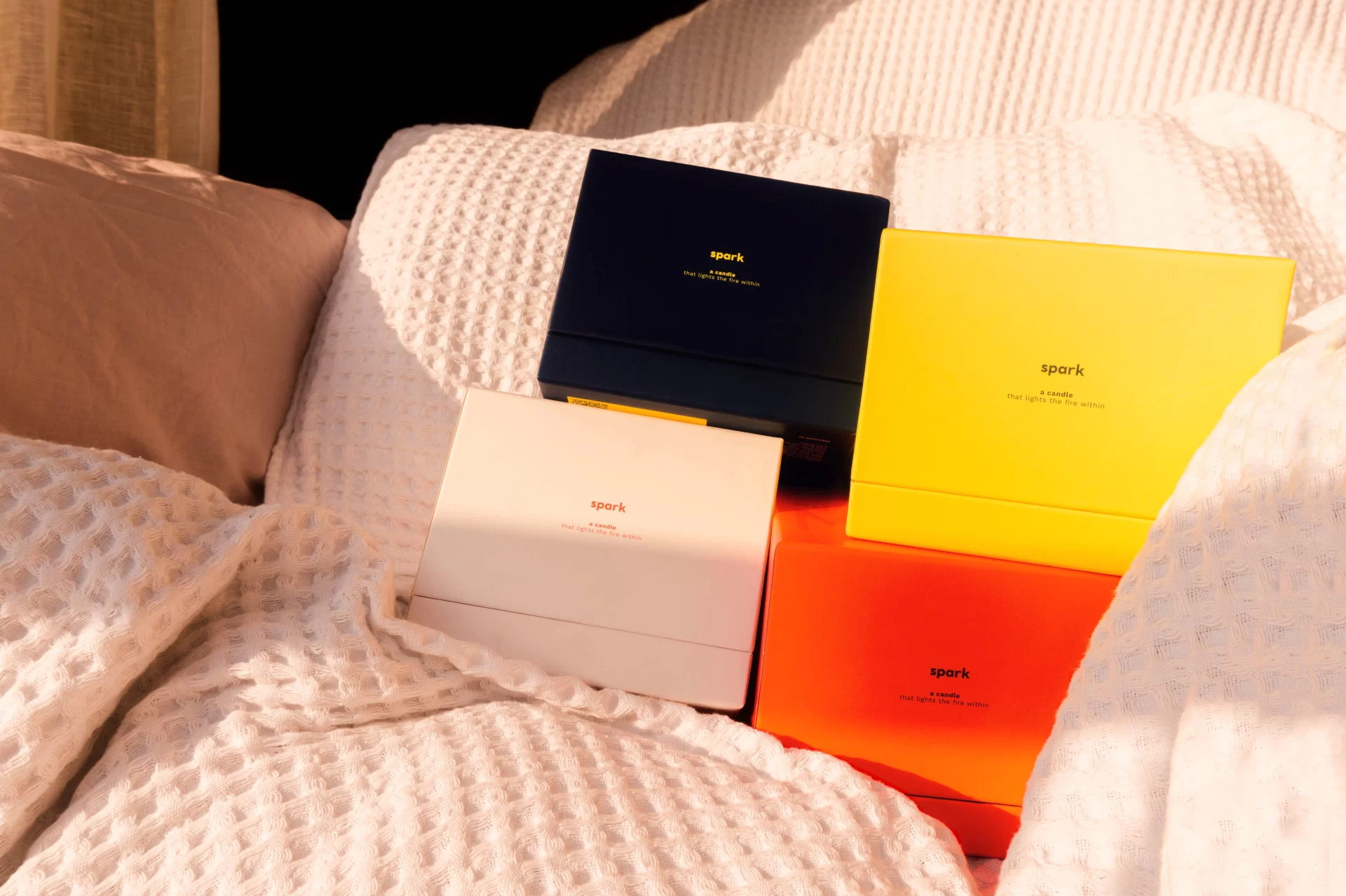
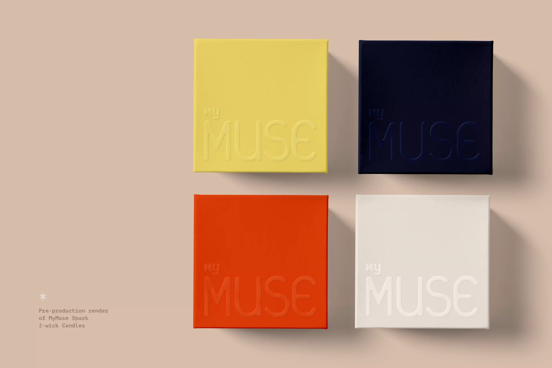
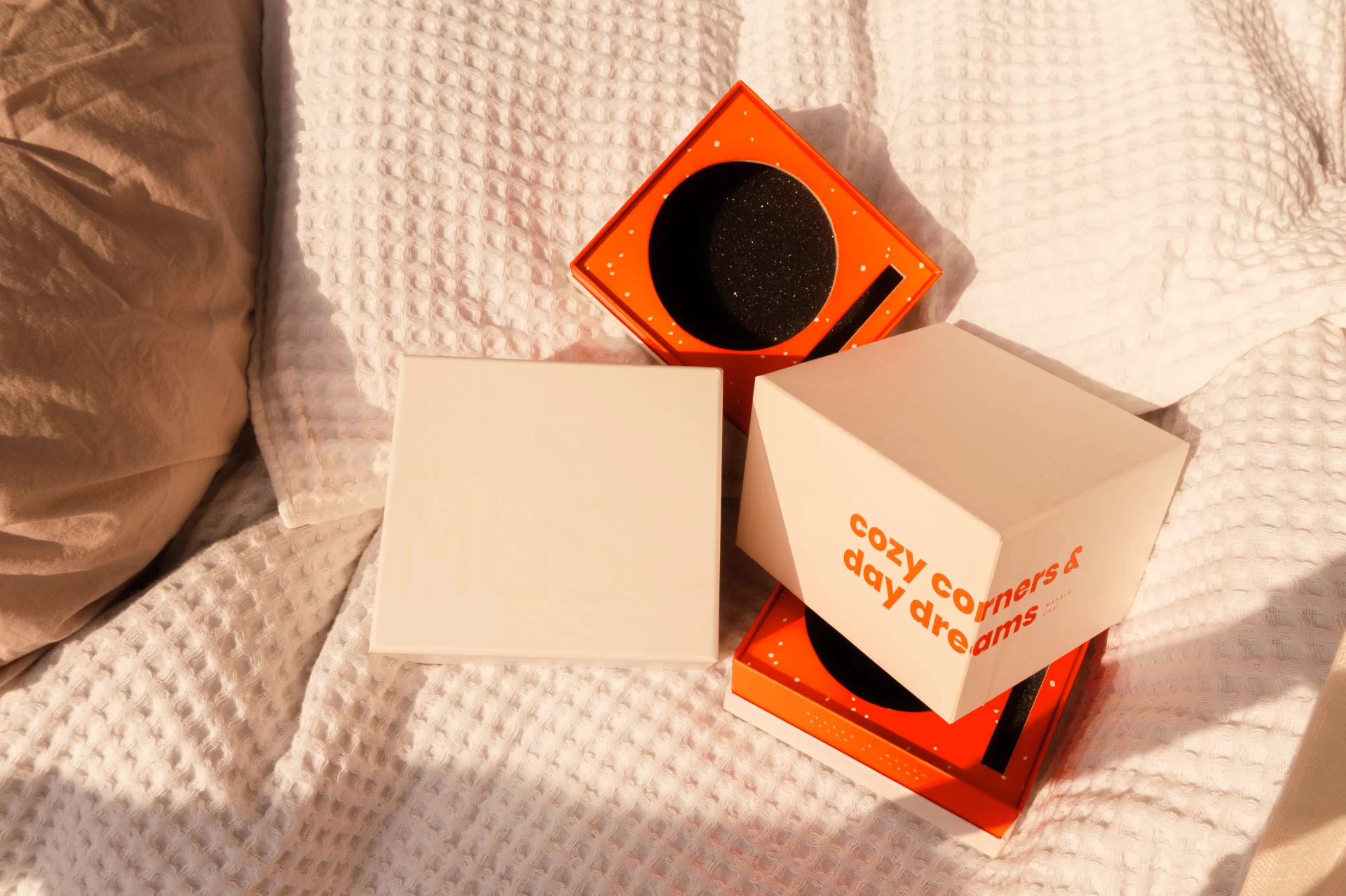
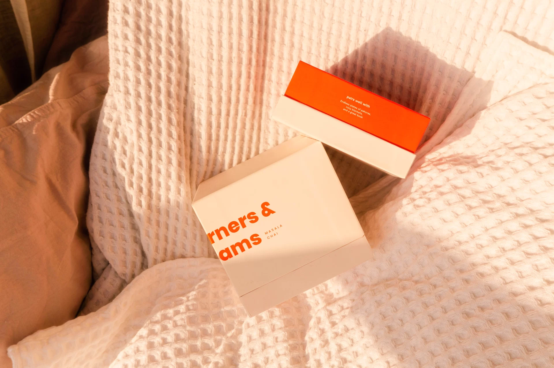
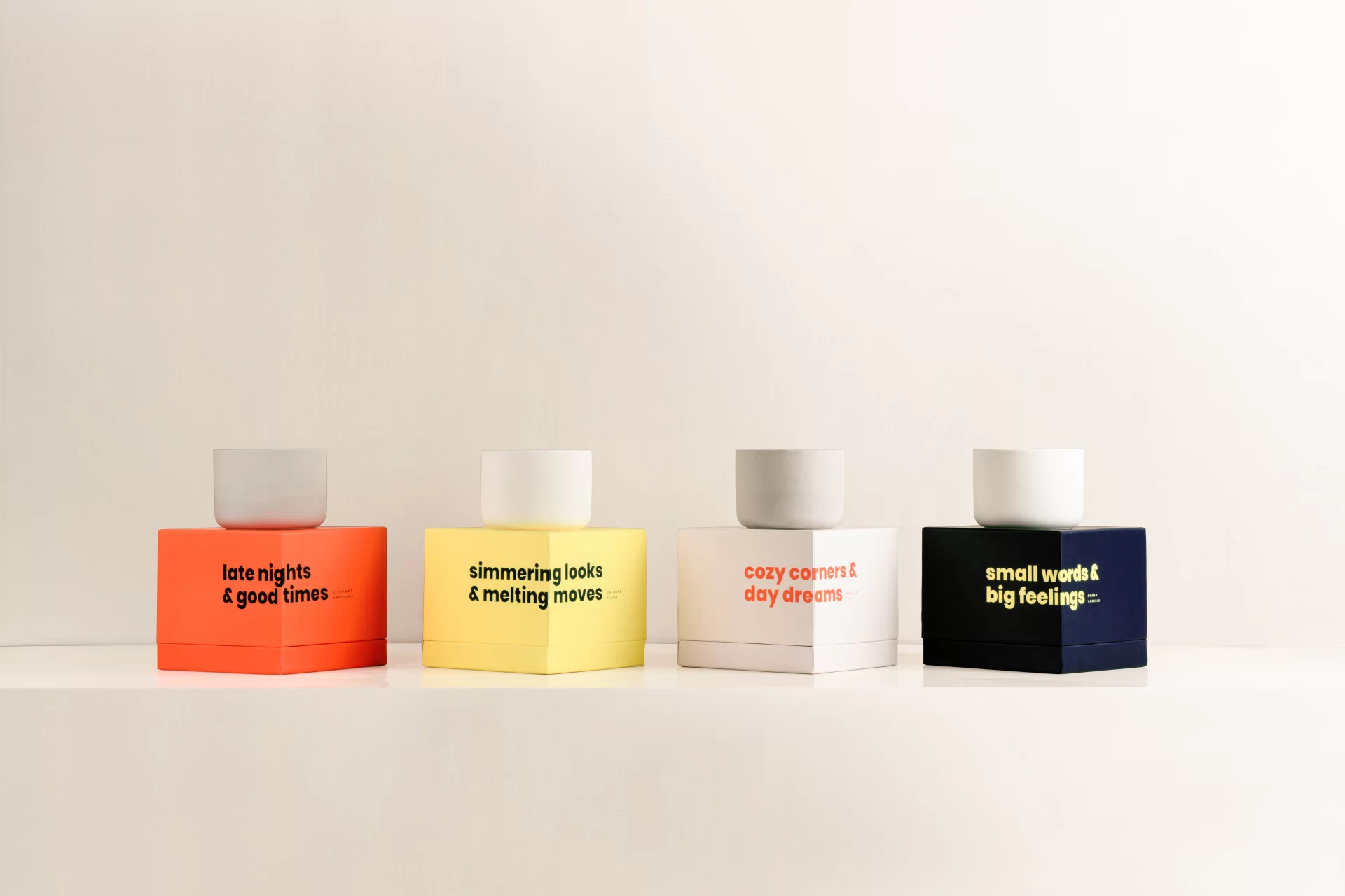
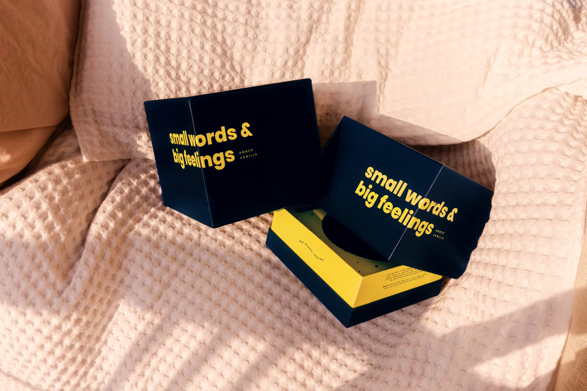
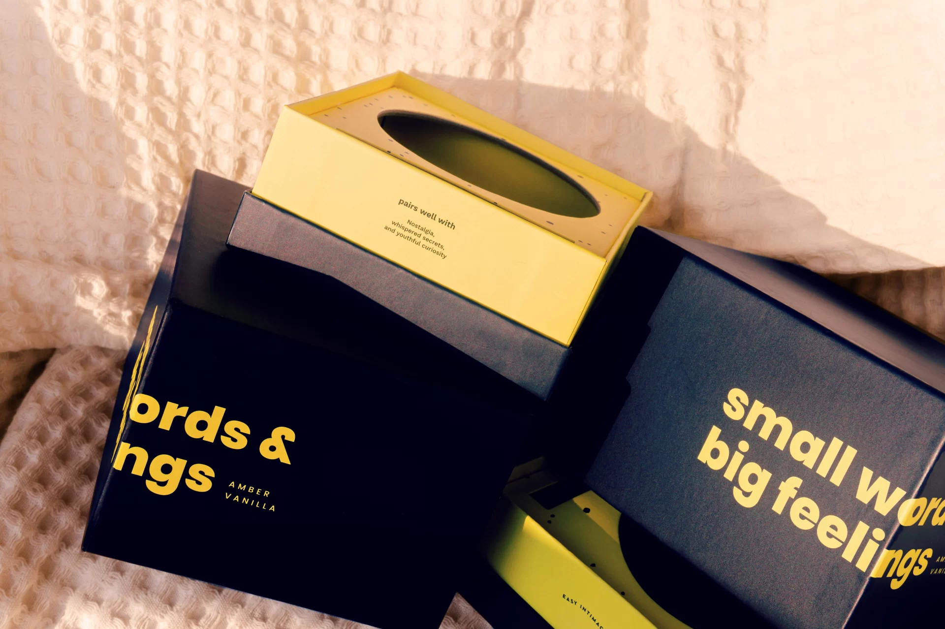
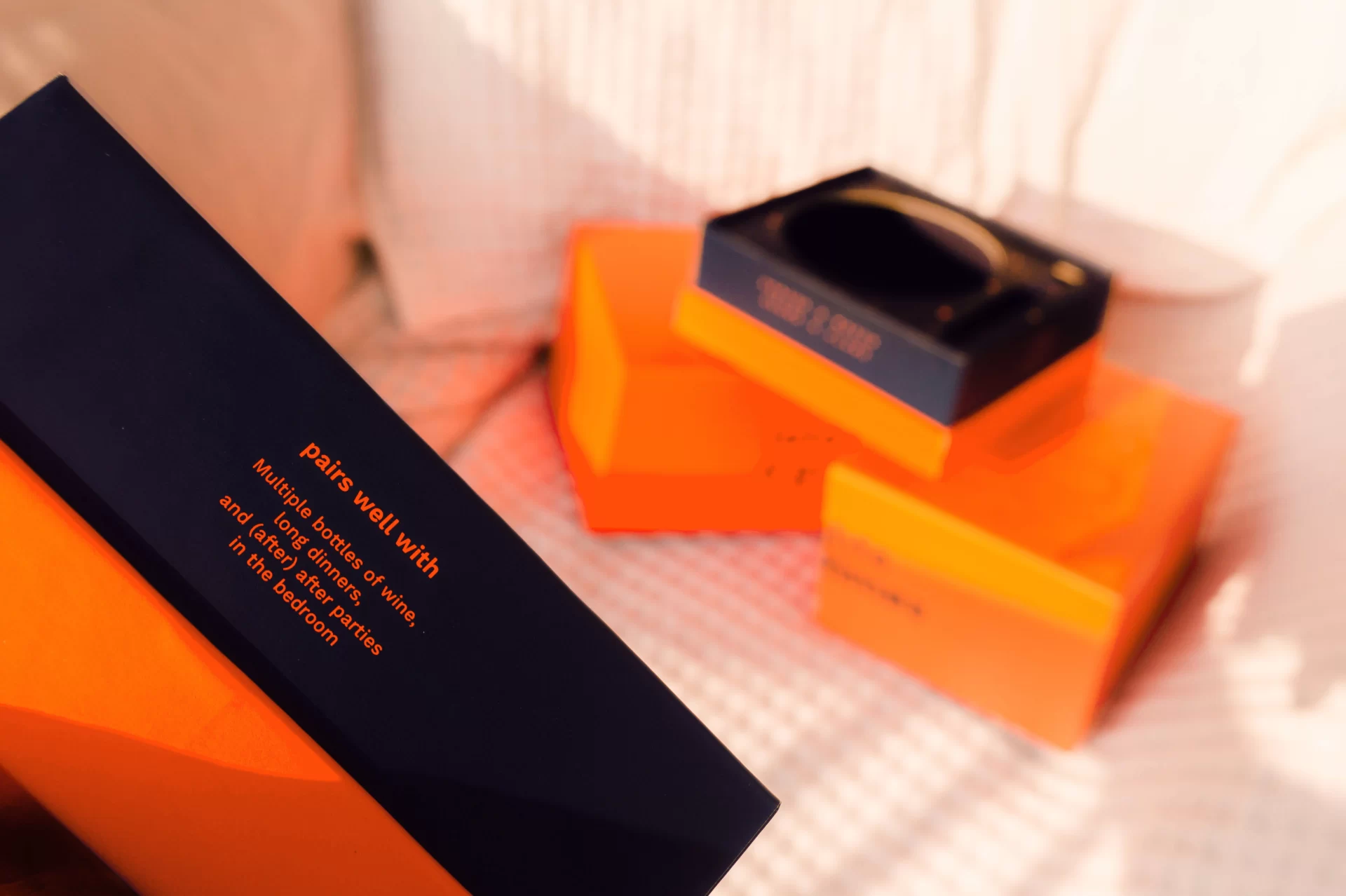
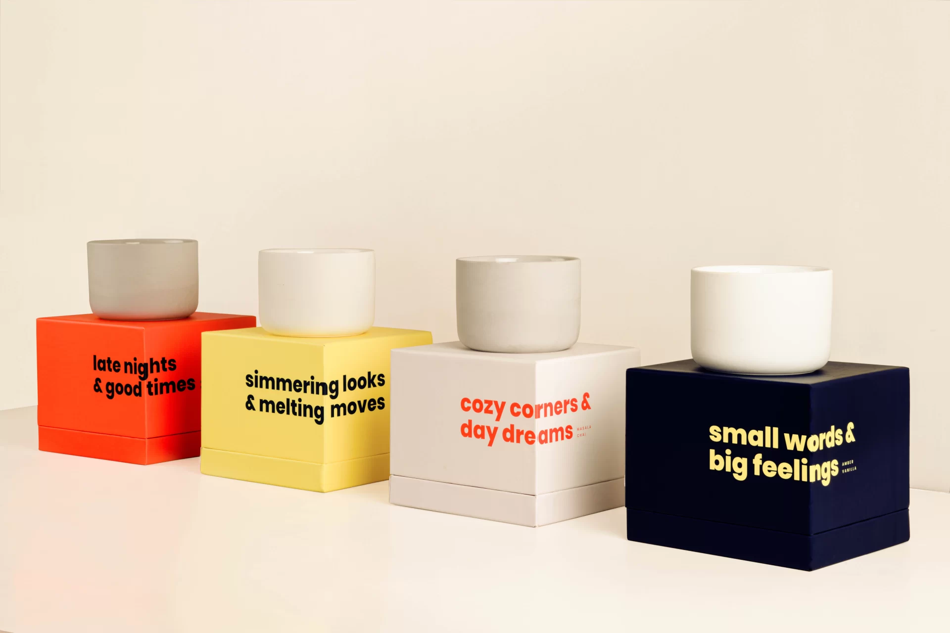
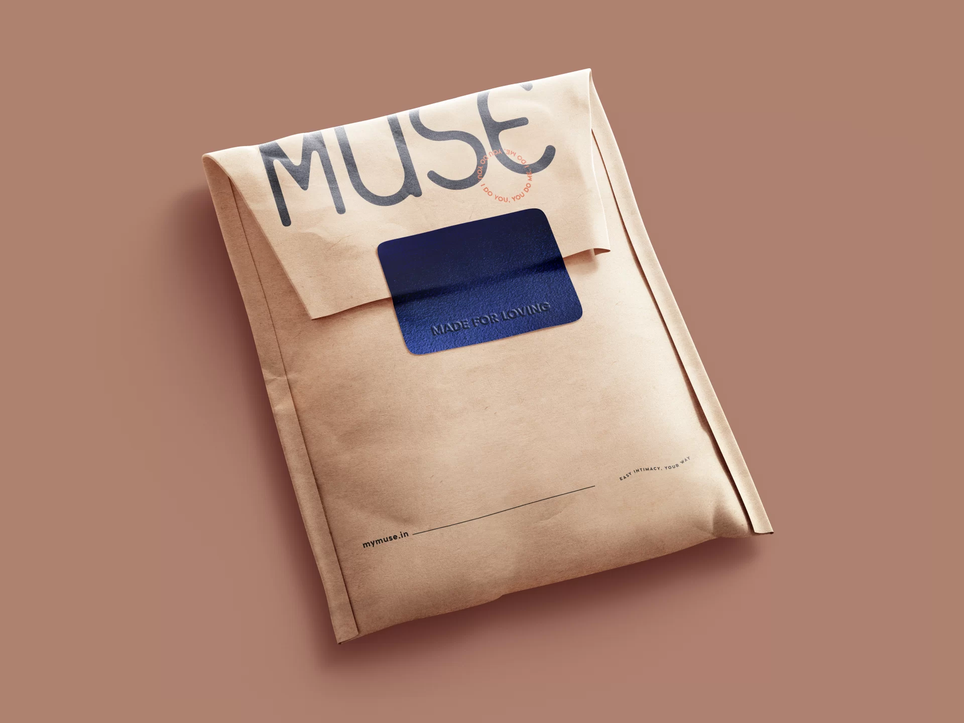
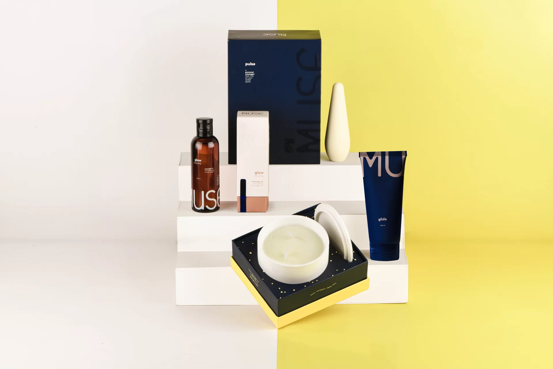
MyMuse’s secondary packaging, on the other hand, is designed to be touched, felt, shared and gifted. Embossed elements, heavy-set construction, a metallic blue accent material and thiccc stocks of paper — all come together to create packaging that makes unboxing these products a whole direct-to-bedroom event on its own.
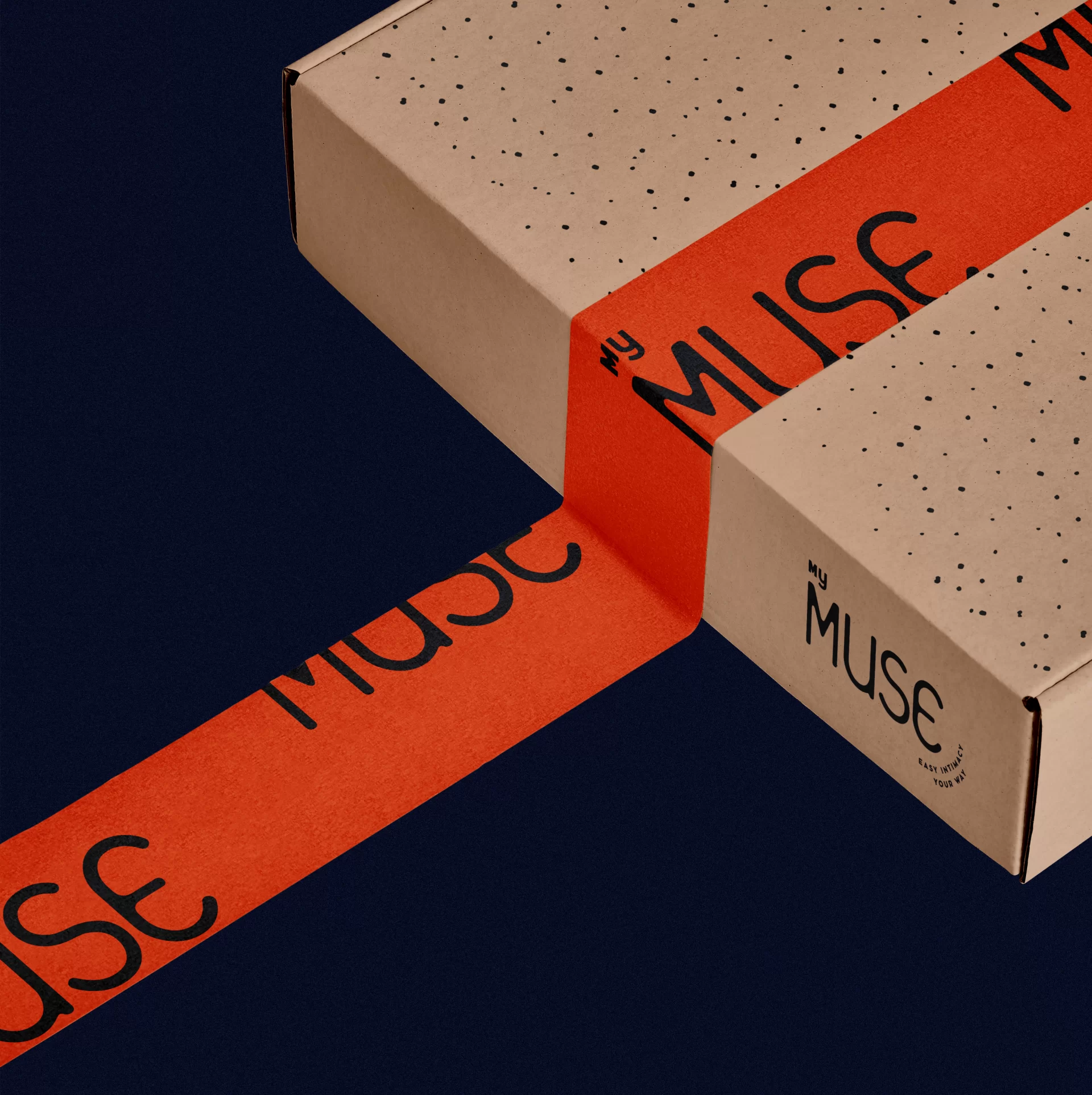
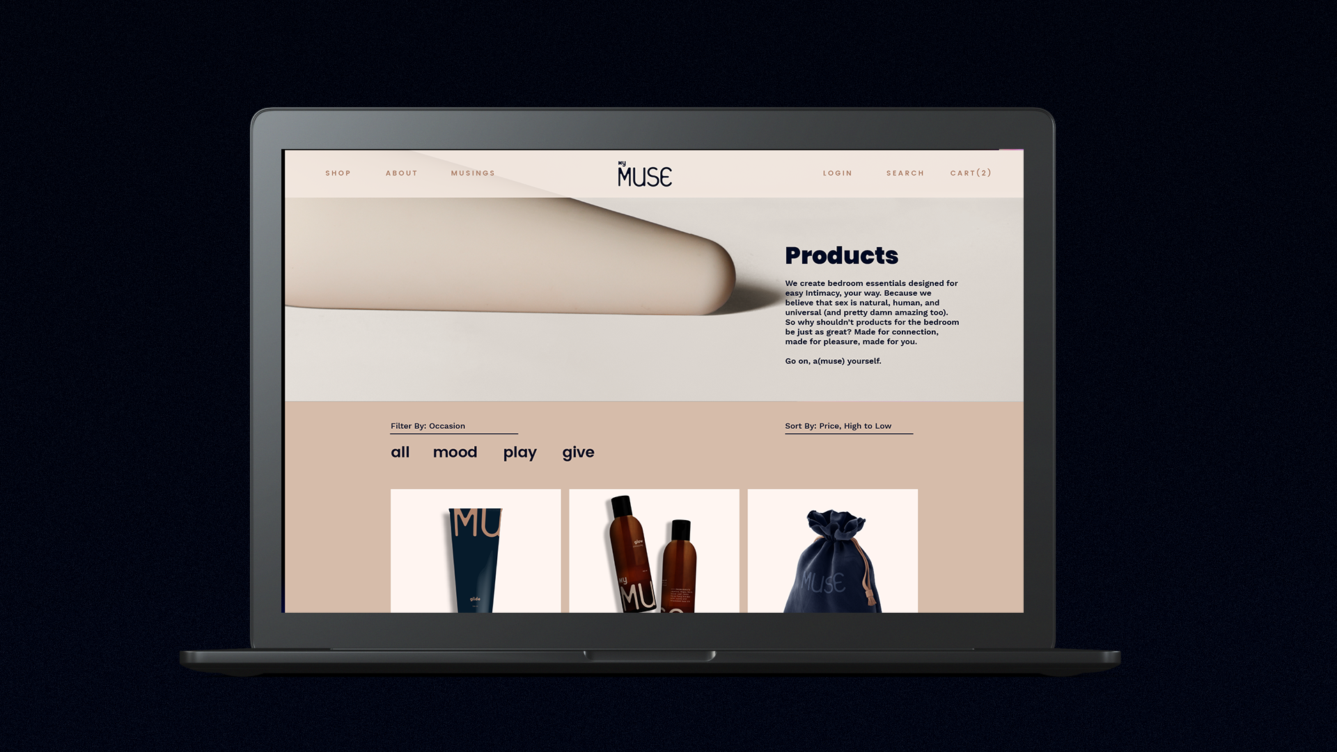
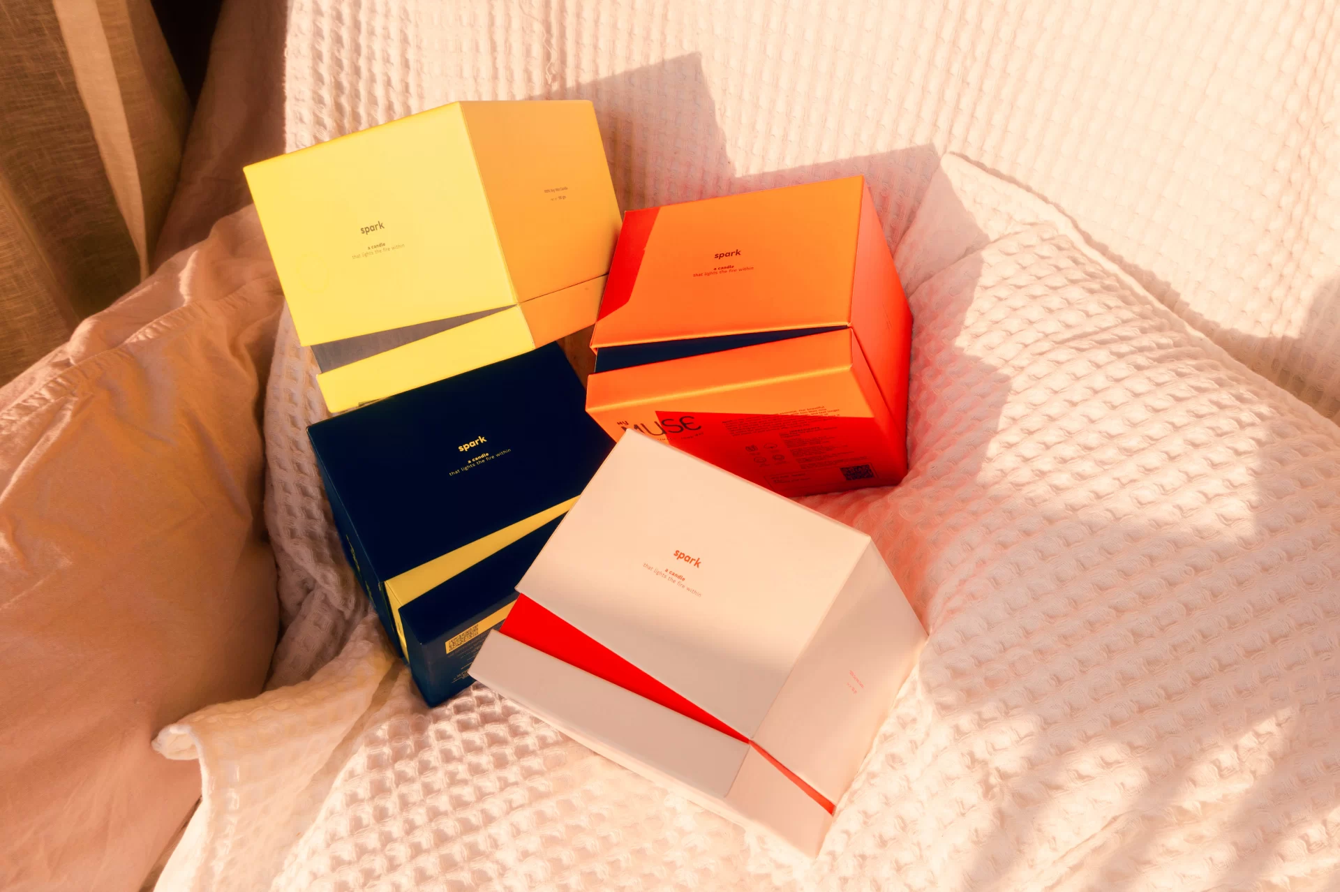
This is the showcase of the primary, secondary and tertiary packaging design along with packaging accessories done for eight launch products of MyMuse. Apart from that, this design exercise lays the foundation for the core colour, ink, material and substrate palette based on which future packaging of MyMuse products are moulded. The packaging has been designed to be functional for D2C e-commerce as well as retail.
Client / MyMuse India
Brand Development, Identity Design, Packaging & Product Photography / Sankhalina Nath
Utility Back-of-Pack Illustrations / Boomranng
Print Production / SCPL Bangalore
See / MyMuse Brand Identity
See / MyMuse Launch Website & Instagram Visual Language