(A CONCLUSION TO Branding a Brewery in Bangalore Part 1: Crafting a Brand Identity System)
One fine Monday morning, I wake up to find that it wasn’t in my dream that I had finished the identity and brand story crafting exercise of a soon-to-be-launched brewery in Bangalore. It was, in fact, that very day I was starting the process of designing its visual identity. Scary business!
I have designed brand identities in the past — this should be easy! Well, turns out it was not. Because for the first time — with an ambitious and trusting client — as the time, place and context all aligned together with the morning routine of the Graphic Design Gods, I had planned on executing a modular visual identity system. A task that required designing a tight system of visual elements and rules that intended to break all commonplace corporate branding trope of logo-colours-fonts-stationary.
A brand and the business behind it is only as strong as its weakest communication.
And for a strong brand — to not merely exist but thrive and grow in today’s time — it needs to flow seamlessly through the numerous tactile and digital mediums that span our times. And this requires the visual identity of the brand to be fluid — capable of change and adaptation. An identity that has opinions, speaks with a confident voice and stands its ground.
Before setting out to do the visual identity, I had carried out a brand positioning and story crafting exercise. That laid a strong foundation to build the visuals on. It resulted in locking the attitude, aesthetic, associations, brand story, copy assets (tagline, qualifier and origin phrase), beer and cocktail nomenclature and a set of guiding principles for the brand.
I designed The Pump House identity as a modular system comprising of a defined set of variables — primarily in English complemented by Kannada as a second language.
I created the various moving parts of the modular visual system as follows:
1. The Logo Lockups & Brand Marks
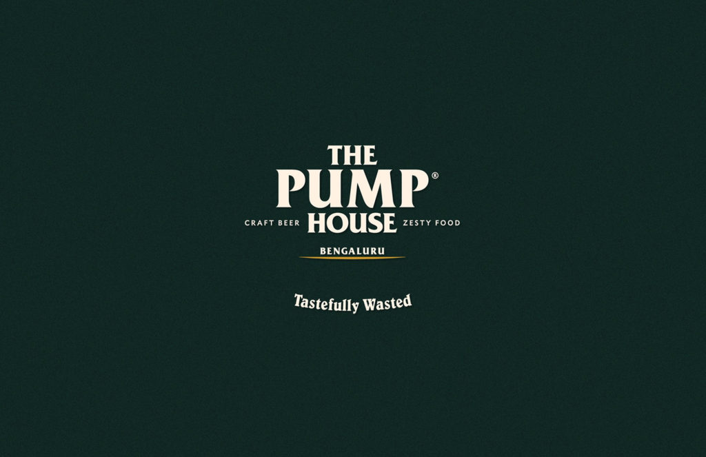
From the very beginning, I and my clients were clear that we would do a “logotype primary” logo. It made sense for a brewery with a name it is proud of.
First things first. I had a detailed conversation with my clients to convince them to not use an obvious symbol like a beer mug or a hop as a part of the logo. The most direct illustration of a business’s offering as it’s logo is a done-to-death lazy approach that I desperately wanted to avoid — at any cost. Don’t get me wrong — it’s not an incorrect approach. But it works only with the right business executed with the right intention in a clever yet honest manner. And I happen to believe that a logo that is literal is like the comedian who has to explain his/her jokes.
From my copy-asset exercise, I knew which were the qualifier and tagline elements that would need to be a part of the lockup. I also kept in mind that I would match the type of aesthetics of the logo across both languages. Armed with these bits of information I went about iterating, sketching and type-testing to come to a final form. Then it was a matter of ‘balancing the structure’.
I like to look at logo lockups as physical structures. Does it have a strong foundation? Is it floating? Can it do without this beam or that ledge? What is the shape of the form? Is there room for hiding subliminal meaning behind it? What do the white spaces speak of? How would it transform when I lay it inline instead of as a stack? Are the angles friendly? Do I feel like respecting this structure?
And so on goes the thinking process and bleeds onto the child lockups to create a solid set of marks for the system.
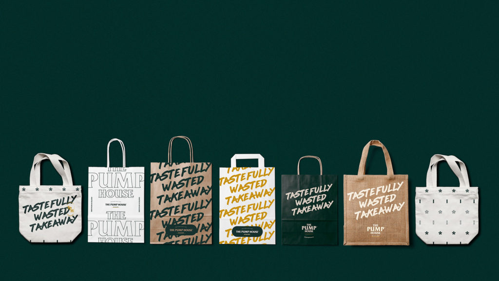
This one is made of 4 primary logo lockups (2 in each language), 5 secondary logo lockups, 4 secondary brand marks, 4 tagline lockups, 1 origin statement, 5 beer badges and 5 graphic devices (1 brand pattern, 1 framing element and 3 outlined brand marks).
Phew! That was a mouthful — but in reality, they have been designed with the subtlest of variations so that they are functional enough for every possible application and yet look like they belong to the same family.
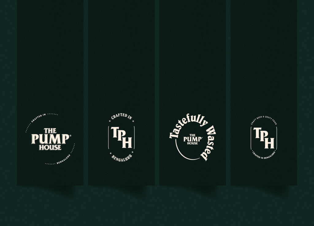
One could think of the primary lockup as the grandfather whose genetic material flows through the secondary marks and lockups.
In case of a future brand extension — like a different location or a packaged or bottled product under the same brand umbrella — I have enough DNA built into the system for it to continue this language.
A multi-lockup visual identity system is like building a fail-safe for one’s brand.
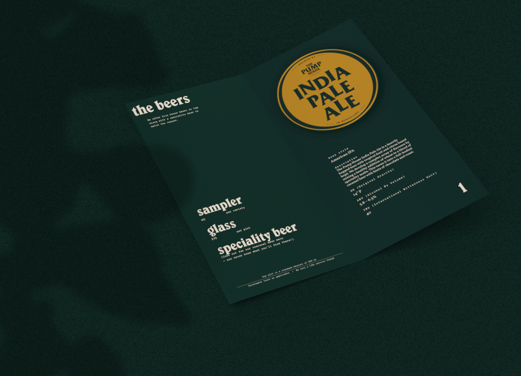
2. Colours
Colour choices for a brand identity are as much emotional as it is functional. Out of three possible ‘colour-moods’ that I presented to my clients, one stood out strong. This one was to eventually become the brand’s colour palette.

A rich beer-bottle green that evokes the feeling of cracking open a fresh bottle of beer — sweating beads of condensation. A mustard-sauce like yellow to dip our imaginary crunchy fries in. A sublime beige that is the first sip of a freshly poured glass — filled with froth to the brim. And finally, a metallic copper accent that speaks of the machinery and tanks of a microbrewery — hissing and spitting steam while reflecting your beer-loving self downing a pint.
The colour choices were functional too — no reason to resort to the default black and white. TPH Glass Bottle acts as the dark shade, TPH Beer Froth as the blank field, TPH Mustard Sauce is the zingy accent all the while retaining TPH Pipeline for special-occasion-only frivolity.
A secondary palette was designed — just in case!
3. Typography
Typography is the clothes your brand’s voice decides to dress up in.
From a functional viewpoint, a brand needs a neat family of print, screen and material production-friendly fonts. From an emotional viewpoint, a brand needs its fonts to speak or enhance the very language it voices. And finally, from an aesthetic perspective, a brand needs its fonts to have style — very much like an outfit that has been put together well.
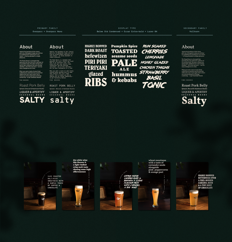
I designed The Pump House system with an extensive primary, secondary and display type family. Overpass and Overpass Mono families function and emote for the brand over every touchpoint — they have a slight angular cut at the ends that mirrors the angles of the main logotype. The Vollkorn family, aesthetically and functionally, touches those notes of the brand that specifically talk about its origin and heritage.
And then comes the display type. Belwe Std Condensed is your witty neighbourhood beer drinker — matching her slanting angles to the brand, just like pairing her IPA with her Teriyaki Pork Bao. Eczar Extra Bold is your no-nonsense beer-nerd — he knows his OGs, FGs, ABVs and IBUs well. As seriously as the angular cuts he sports. And finally Lazer 84 — the wasted one, the slightly unhinged one — drinking away without a single care for the world.
4. Accessory Graphics
The Pump House brand identity system is enhanced by 1 brand pattern, 1 framing element and 3 outlined brand marks as its accessory graphics.
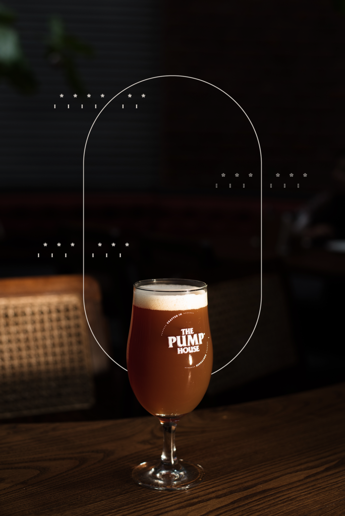
The brand pattern is an abstract depiction of a flowing field of flavour and ingredients, all bubbling away inside a beer tank. The framing element is a simplified minimal beer tank form. And the outlined brand marks stand bold in their angles and curves — as a repeat pattern or even purely on their own.
5. Brand Applications & Production
Aesthetic, style and personality aside — the biggest demon that needs conquering while designing a brand identity are the practical constraints and variables.
Throughout the process, I was knee-deep asking myself an unending number of practical questions — that all needed answering before putting anything on the line.
What industry is the brand from? How will the identity be relevant? What are the production materials? What are the communication channels? What is the production budget? What are the constraints of this material and that space and this size and that light? Who are the vendors executing the production and will they be able to materialise this design? If yes, can it be maintained? Will it be expensive for the client to maintain?
Will this design bleed ink and become illegible when printed on a certain material? How many times that said material will go for laundry before it is replaced in a cost-effective manner? What are the municipal rules that constrain us?
Which LED is more like neon and less like an LED? How do I reconfigure my design, so that a cheap production method does not come across as cheap? Wait, there is an International Bitterness Unit!? What is that beer-tap manufacturer’s Youtube channel that shows how to install the beer badge?
Well, this was a cognitive load I wasn’t prepared to bear but now that I look back, boy I am glad I did! I realised through this process, how designing a brand from end to end is so much beyond a ‘visual design job’.
And if I as the designer don’t keep these things in mind, who will?
6. Subliminal Elements
We, humans, are incredible machines when it comes to understanding and communicating. There is the written language and the spoken language, the visual language and the body language. But what about all the subconscious information we take in? The way we perceive light? The textures we like to touch or even the smells that rekindle a memory.
A quiet but no less important part of a brand’s identity design is to be intentional with sensory cues. As designers and humans when we start respecting the way our bodies and minds work — there is a plethora of sensations we can choreograph to be a part of a brand’s language.
For this project, I wanted to play with our perception of light and shadow. The brewery itself has been designed to stream sunlight in streaks throughout the day, bouncing off wood, suede, brick and foliage to create a dance of visuals. I wanted to graphically incorporate as much of it as I could — to be like an aftertaste that remains even after the last spoon of dessert has been long gone.
7. Language
In a country like India, we have lived with layered and hybrid identities from the historical times — methods of communication and identification in such a state only get complex over time. But once we accept it as a way of life, the fog clears and the truth becomes simple.
I was taught this simple truth by someone that we do not exist as ‘this OR that’ but as ‘this AND that’. That changed my life — or at least my design approach.
A brand always inhabits a certain culture and geography. It inhabits people. And we as a polyglot country can no longer neglect the importance of showcasing our mother tongues with pride over our brands. Even if it functions as a secondary language, it is time we let them sit in a space that is no longer apologetically forgotten somewhere in a byline. In fact, making a local tongue primary could act as a massive unique signifier for a brand moving forward.
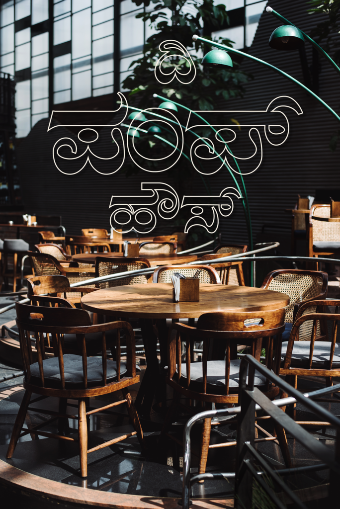
The Pump House identity is Kannada as a functionally secondary tongue. But its personality is rooted in Bangalore and there is no separating that language from the state. I do not read, write or speak the language and yet I wanted deeply to design the Kannada logo with the same respect as the English one. Match the same angles, create the same visual hierarchy and most importantly use it across collaterals in reckless abandon.
8. Rhythm
Exactly how good music follows a rhythm and a beat — a brand’s identity needs to be applied in a consistent pattern. This is what we can call repeatability of a brand. The core strategy that creates recall value of a brand — much like sometimes how we can remember a tune but not the song.
I wanted this identity to flow over intentional repetitions. The trick with applying modular identity elements over brand collaterals is the exercise of constraint. Use only as much as required and build on top of it only if absolutely necessary.
I like to design brands using a self-imposed ‘Least Intrusive Rule’. Every time I create brand collaterals, I ask myself, “How can I communicate a brand’s visual language using the least amount of logos, marks and other visual assets?”
If a photograph already shows the logo somewhere and establishes the brand, why use another logo on top of it? If the imagery follows the mood and aesthetic of the brand, why slap chunky graphics or type on top of it for the sake of it? How do I make a graphic breathe?
Over time, this consistency will speak for itself. Like the heartbeat pumping a steady blood flow through a dynamic brand.
9. Space
Back in design school, I was forced to sign up product design and material exploration courses when all I wanted to do was play ‘Photoshop Photoshop!’
Designing the signage and installations for The Pump House reminded me of those hot Bangalore afternoons when I and my batchmates would run around hardware markets figuring out materials and electronics to create stuff.
Not that I would pass up any chance to create anything ‘type’ in 3D. For this project, I played around with exploring hard metal and lightbox layers sandwiched together but cut into the delicate shapes of brush letter type. I designed for LEDs that act as faux-neon. And to my heart’s content designed for metal mesh type as tall as me.
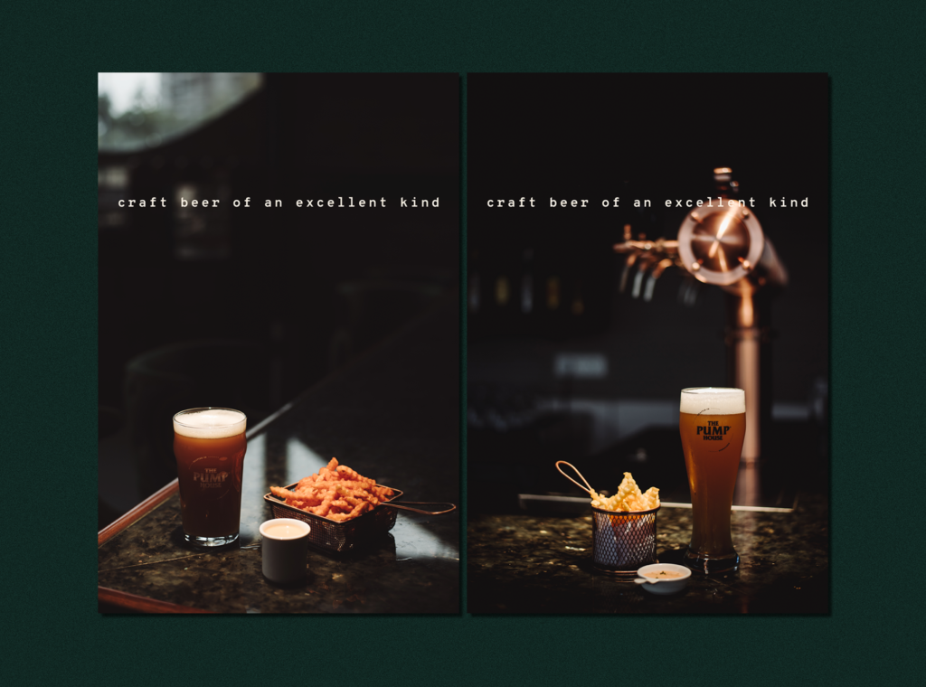
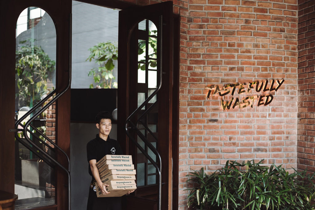
10. Imagery
And finally, the most ‘real-estate’ grabbing brand asset one needs to pay attention to is photography and imagery. A photo speaks so much at a go that no amount of logos, marks, colours, words or type can.
Photography for creating brand assets need to be intentional to the last pixel. What is being photographed? Who is being photographed? What can I add, subtract or modify? How much light? How much shadow? Who is the photographer and what is his or her personal aesthetics? Does it add to the brand and how? Do I need to stage the scene or shoot natural surroundings?
A photoshoot is a time and money intensive process and the cost of not getting it right is way higher than the cost of the shoot itself.
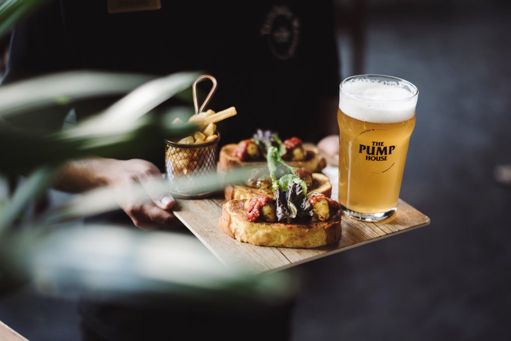
For The Pump House, I landed very luckily upon the photography style of Aakash Kedia. The creaminess of the shallow depth-of-field, subtle nudged of the delicate foreground, the dark mood, the streaky lights and the expansive compositions that came with him all added to the brand’s vision.
The same vision I instinctively dreamt up in my mind on that same Monday I woke up scared that I won’t be able to design a brand identity system this ambitious.
…
I always insist on building a strong foundation for any branding exercise. Such brand assets may not earn you financial currency in the short term but they compound your brand’s social currency many folds over in the long run.
…
Read / Crafting a Brand Identity System Case Study
See / The Pump House Brand Identity Design
See / The Pump House Bar & Restaurant Collaterals
Design Case Study
See / The Pump House Signage & Space Installations
See / The Pump House Brand Imagery
If you want to explore how to position and create identity assets for your business, feel free to reach out and open up a conversation .
You can also follow me on Instagram for behind-the-scenes and work process.